Customer Experience Enhancement (2021)
The Bay - Core
The Bay, previously Hudson's Bay, is a Canadian luxury goods department store chain. As a sole product designer in the team, I led all the designs in The Bay. CX project was one of big main projects. The Bay continuously improve site CX and overall enhancements to ensure the website remains competitive and relevant. Our core strategic mission is to be a digital first company and in order to achieve this we need to offer a great frictionless customer experience on our digital platforms. The collections of selected segments below are a result of ongoing collected feedback loops we have received from VOC, observation of e-commerce trends and competitive analysis.
Since the organization had a big change of banner separation in the beginning year, I had worked as a sole product designer. For the future opportunity, I wish we could have more capability to do some user researches.
Role: Lead product designer, User research, UX/UI design, Service design, Prototyping
3 Projects led
Vendor Media
Communicate with vendors to find the advertisement opportunities within The Bay website
Loyalty
Building The Bay Rewards program and services
Customer Experience (CX)
Build and enhance services and features across The Bay website and app
My Role
Directly work with business team and define requirements
Market research and watch Fullstory user interactions
Built wireframe, ideas, and prototypes for all the features in The Bay
Test design with QA team and approve designs to release
Hire designers, Build foundation of the product design team, Design Review, Design Community
Target User
The Bay customers in Canada who use The Bay website on desktop and mobile devices.
The Goal
To offer a great frictionless customer experience on our digital platforms.
The Problem
The Bay website online shopping experience for customers is continuously receiving voice of the customers. Customers experience uncertainty throughout the buying process. We keep tracking these from VOC through Medallia, and Fullstory.
How might we navigate customers successfully to buy a product without any confusion?
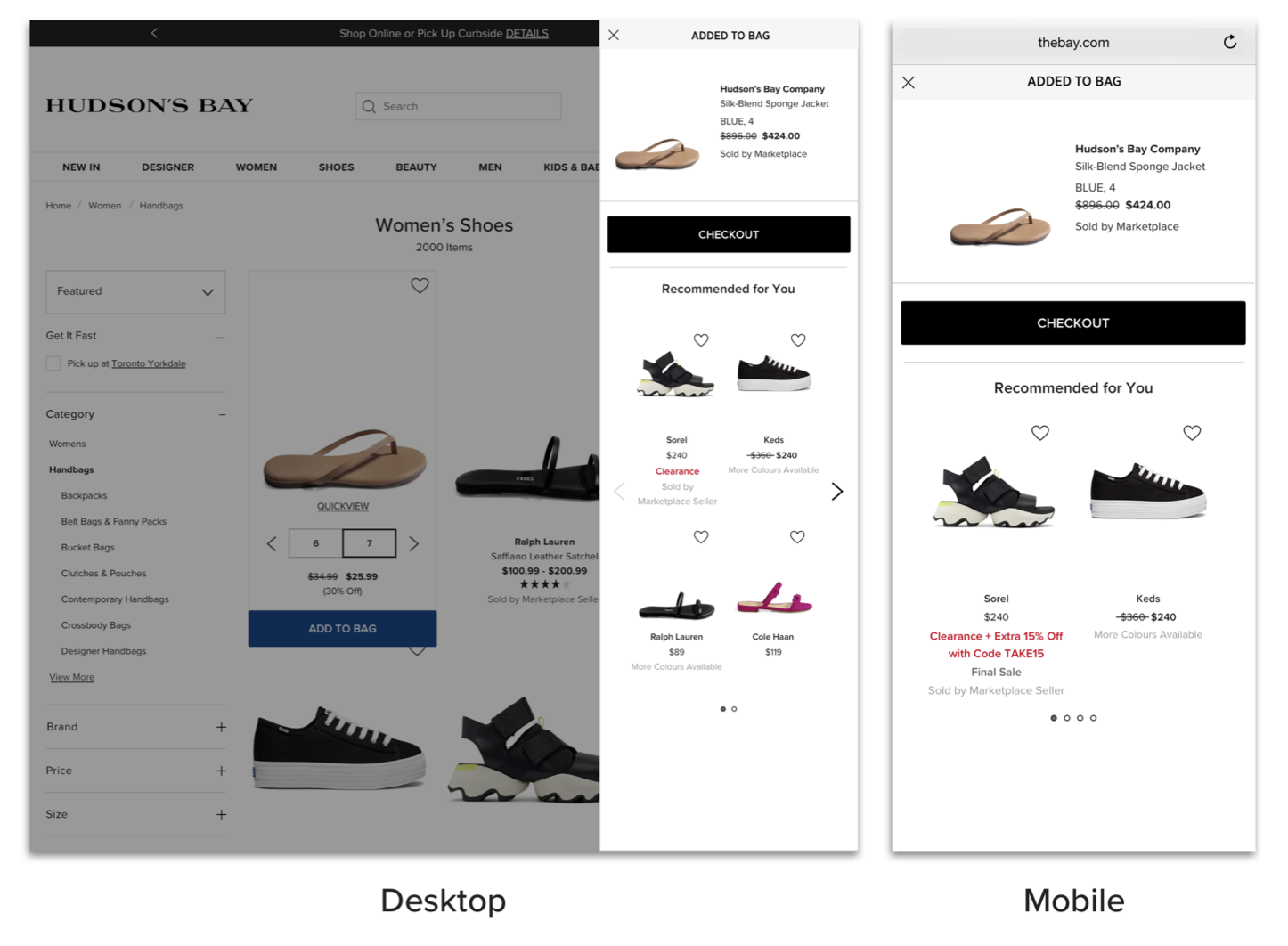
Einstein Strip (Recommendation Strip)
Einstein strip enables users to add more items once they add an item to their shopping bag. It also provides opportunity to check their added item.
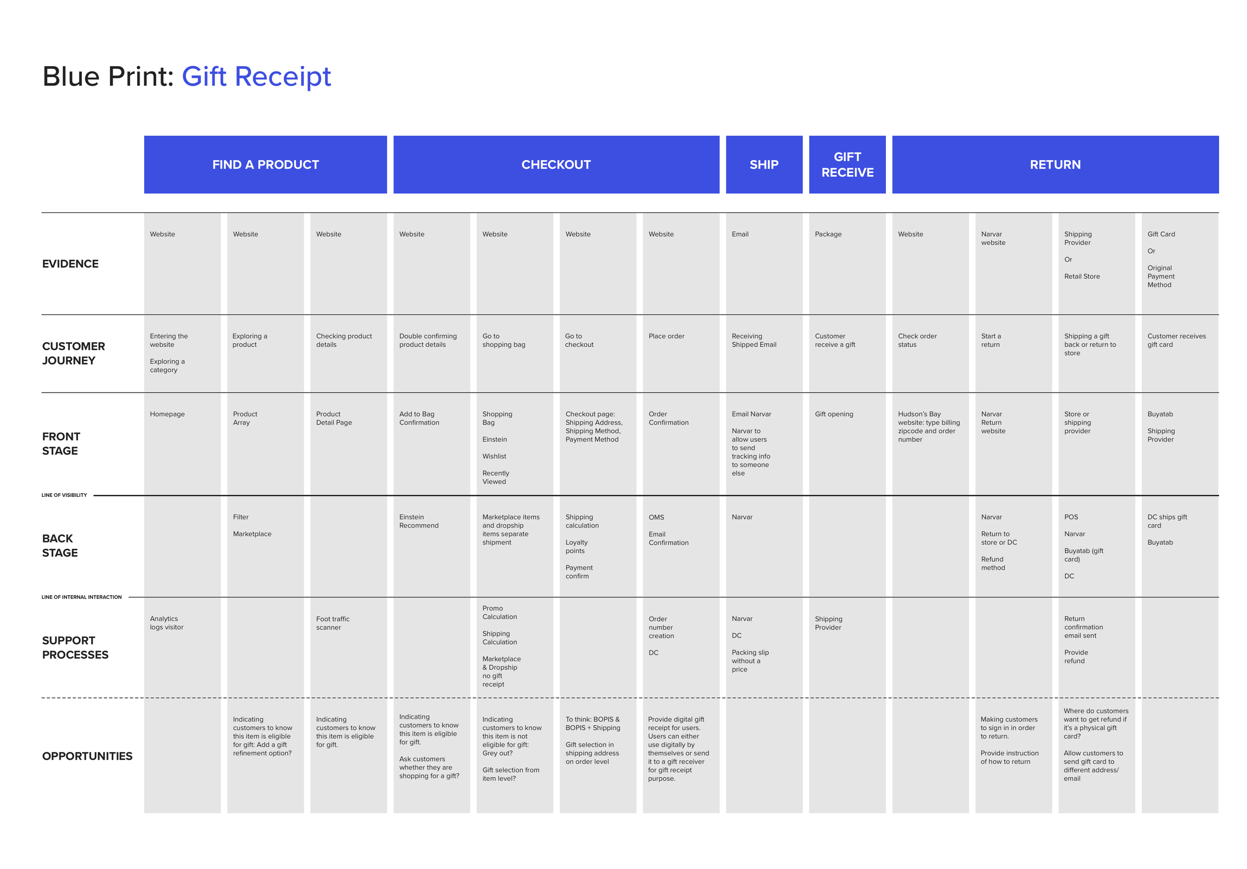
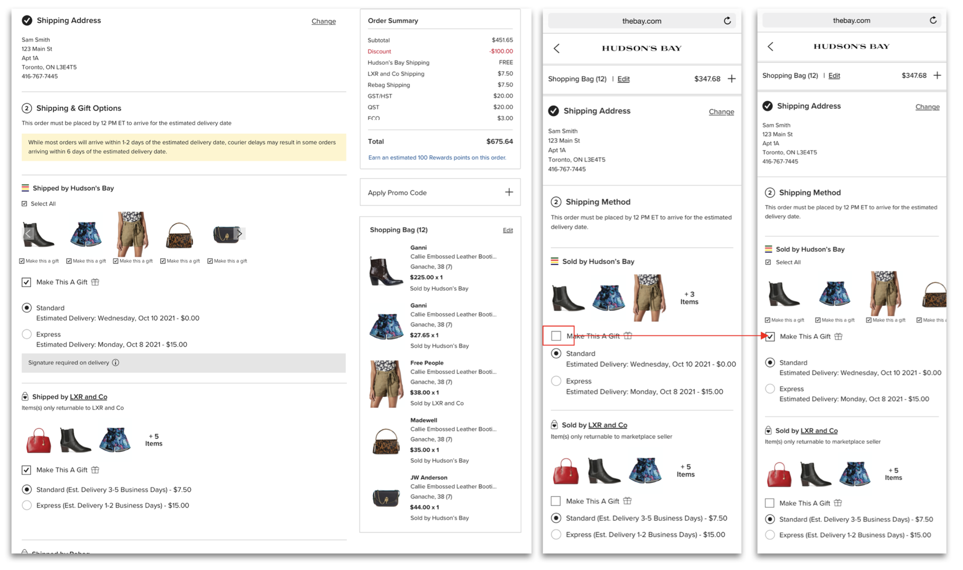
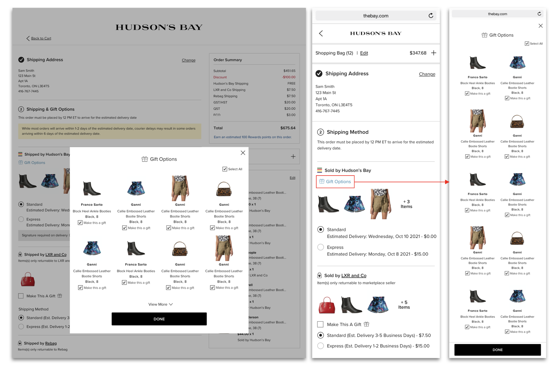
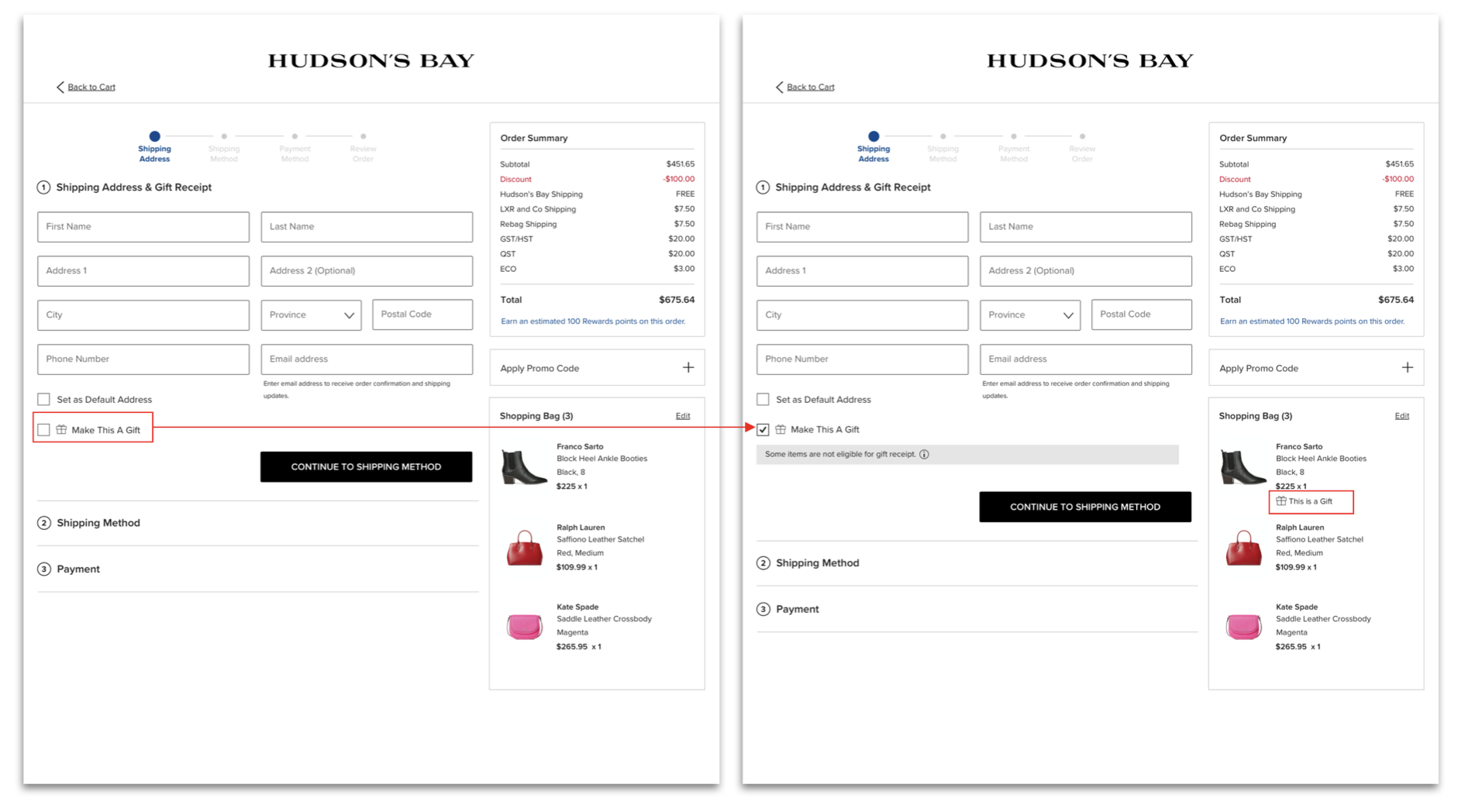
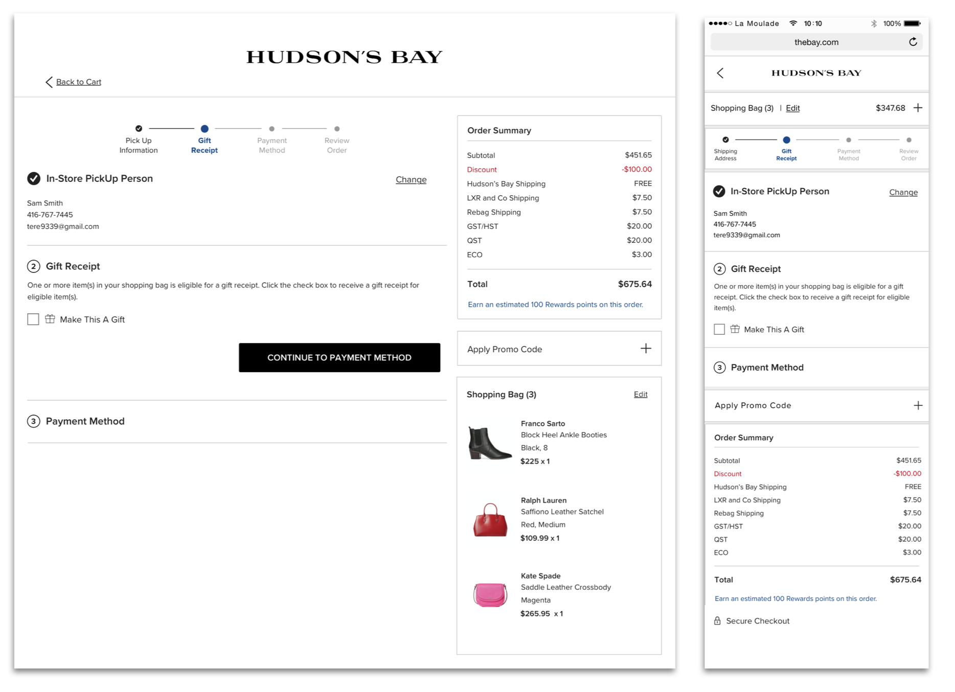
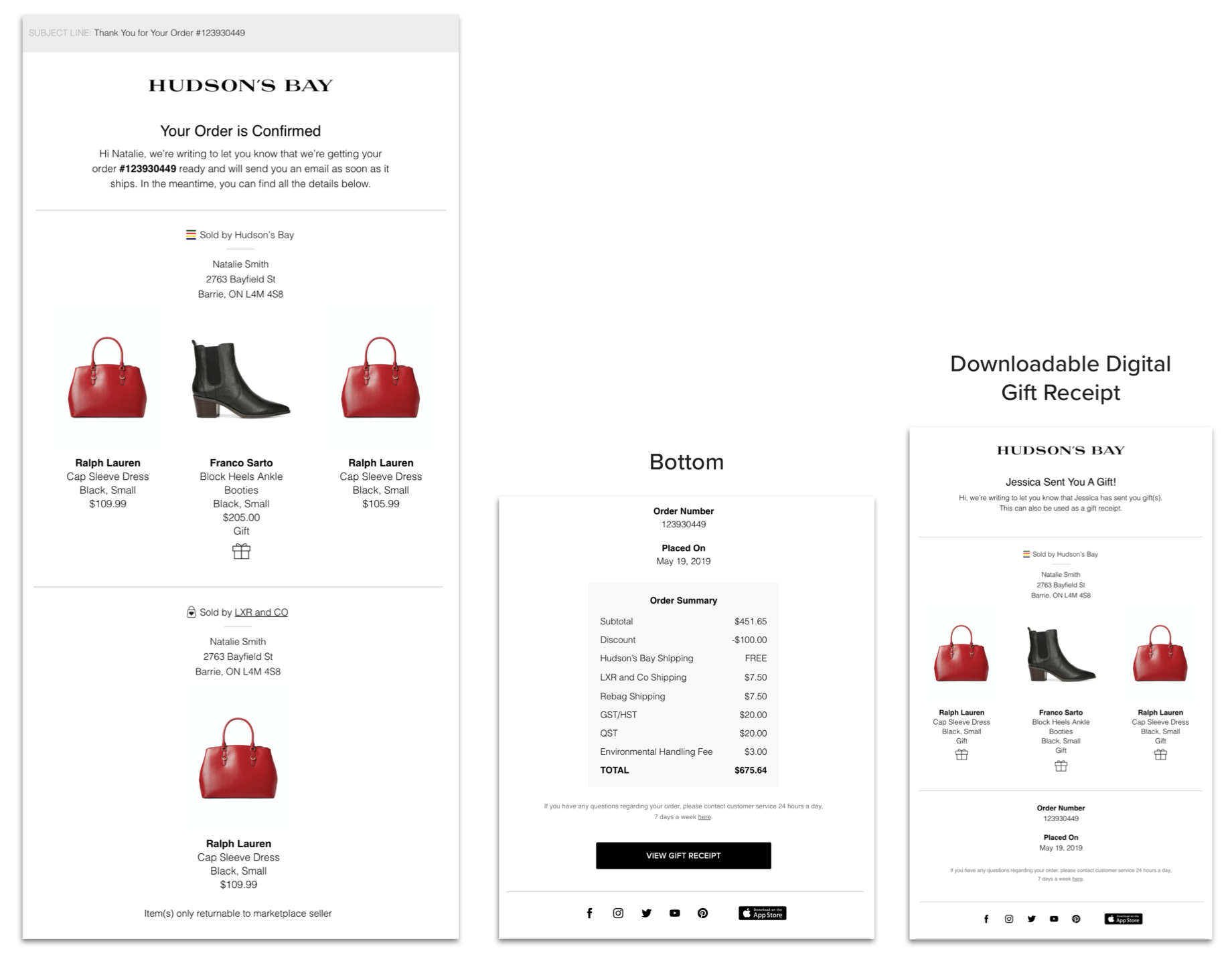
Gift Receipt
When holiday season comes, a gift receipt is an opportunity for users to send a gift(s) more freely to their family or friends.
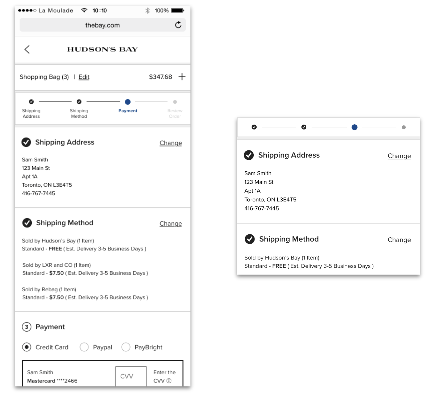
Progress Indicator
During the checkout, a progress indicator allows users to check their progress and also how many steps are left. Depends on users’ shipping/pick up methods, checkout steps change.
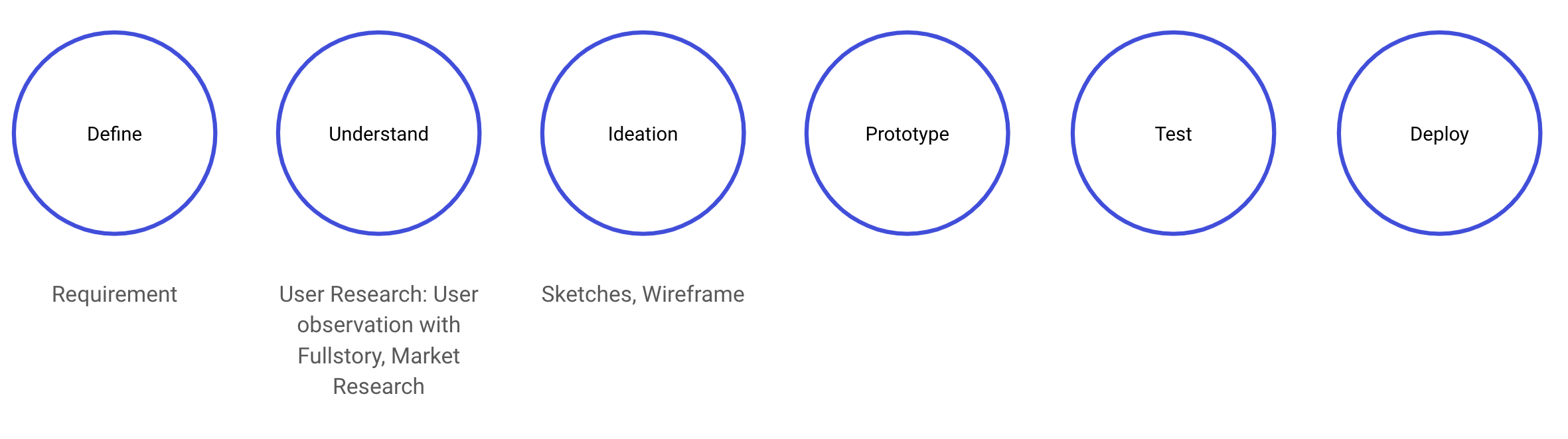
Process
With the limitation of the timeline and team capability, I started from market research and data observation through Full Story and Medallia.
Einstein Strip (Recommendation)
The requirement was given to add an “Einstein Recommendation Strip” (a recommendation area for customers to view more products they may be interested in) into our current Mini bag.
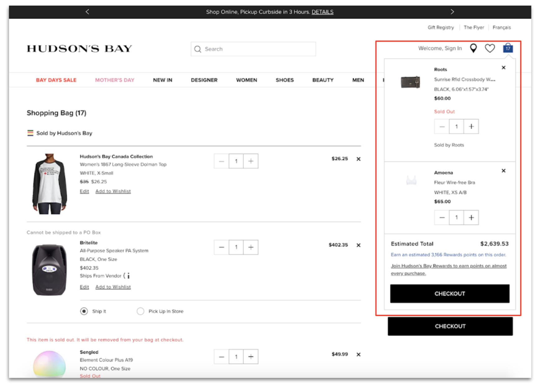
Previous Design: Mini Bag
Competitors do not have recommendations in their minibag, but they have recommendations in confirmation page.
Suggested idea: When a user adds an item to the bag, the confirmation page shows up with some recommended items. By adding a confirmation page, The Bay can leverage the real estate of the confirmation page.
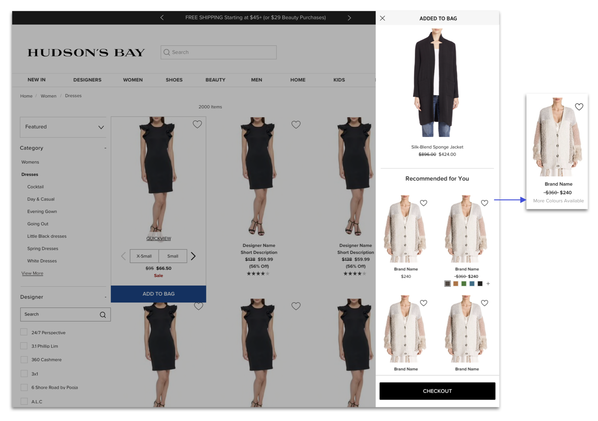
Wireframe desktop
I chose a side drawer for the confirmation page. I wanted users to see what they have selected while they are at Product Array, or Product Detail Page by transparent background. It helps users to double confirm about their selection.
Because of the technological constraints and site performance, I had to change color selection to “More Colours Available”. Spellings are Canadian based, and all designs should consider French users as well.
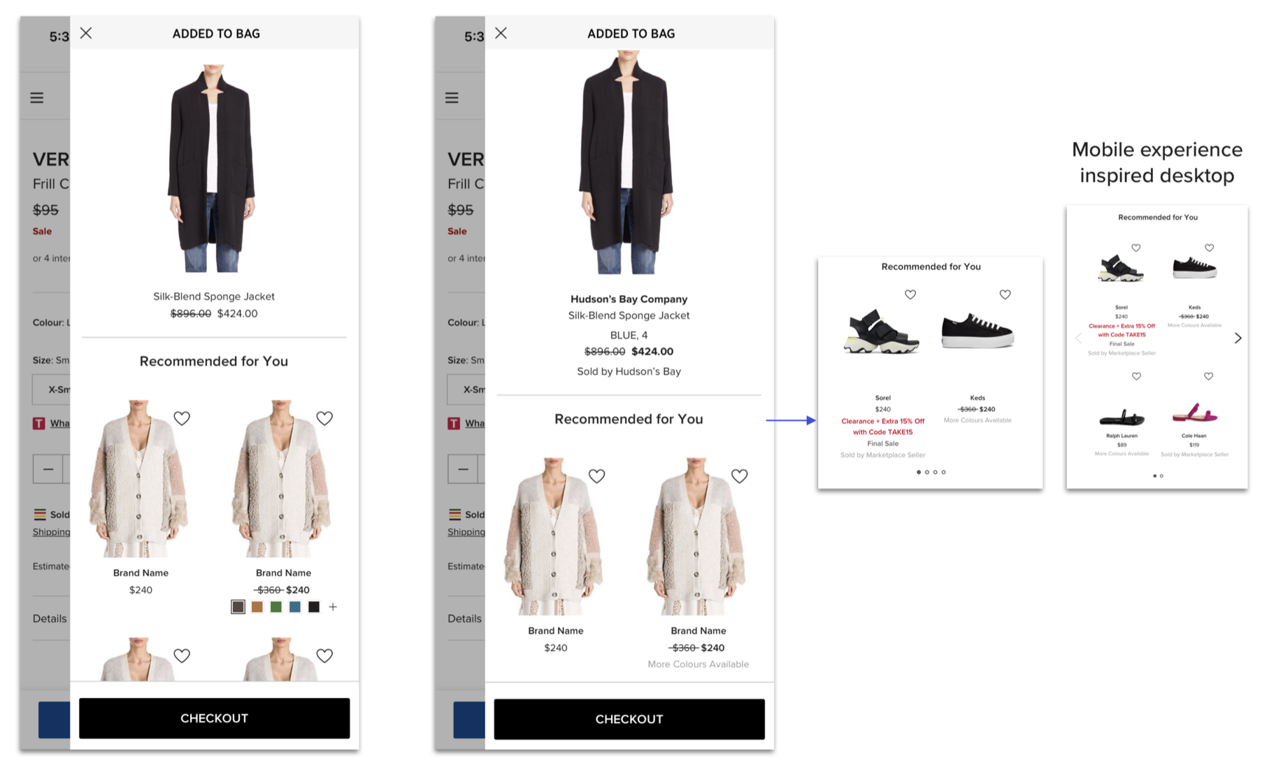
Wireframe mobile
For both desktop and mobile, the recommendation strip was designed vertically in the beginning. However, when it comes to a mobile experience, I could see our customers are used to side scrolling from Fullstory, and it’s also clearer to show that there are more products with dots and arrows.

Final Design
From the Fullstory research of how users are interacting with CTA button at the bottom, users tend to miss CTA button if it’s at the bottom. Accordingly, “Checkout” CTA button was moved to the closer position to the product details. By moving the CTA button to the top, it helps separating the product details and Einstein Recommendation.
For mobile, to prioritize the Einstein Recommendation feature, the confirmation page real estate was enlarged to full screen. It helps giving more space between products, and space in French version.
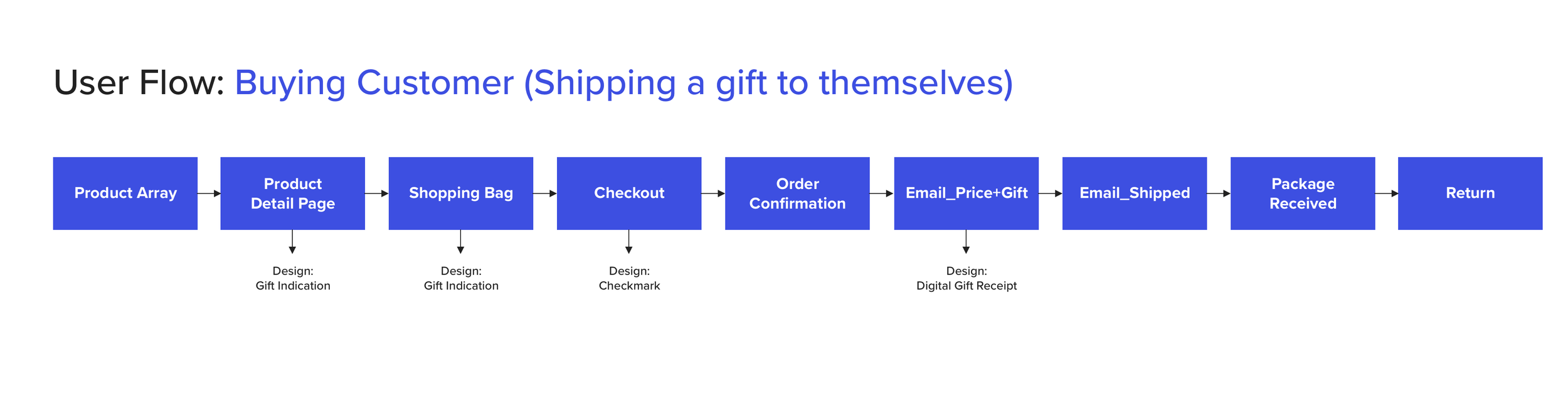
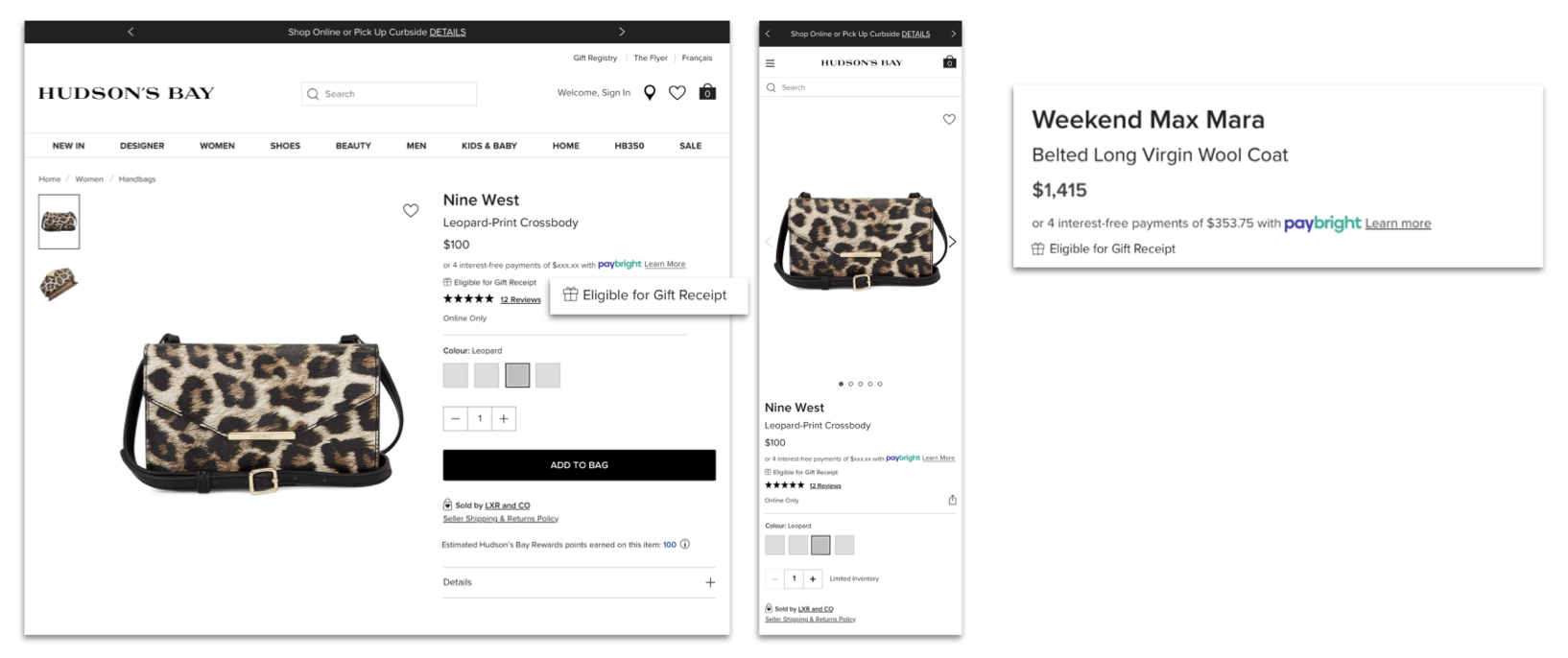
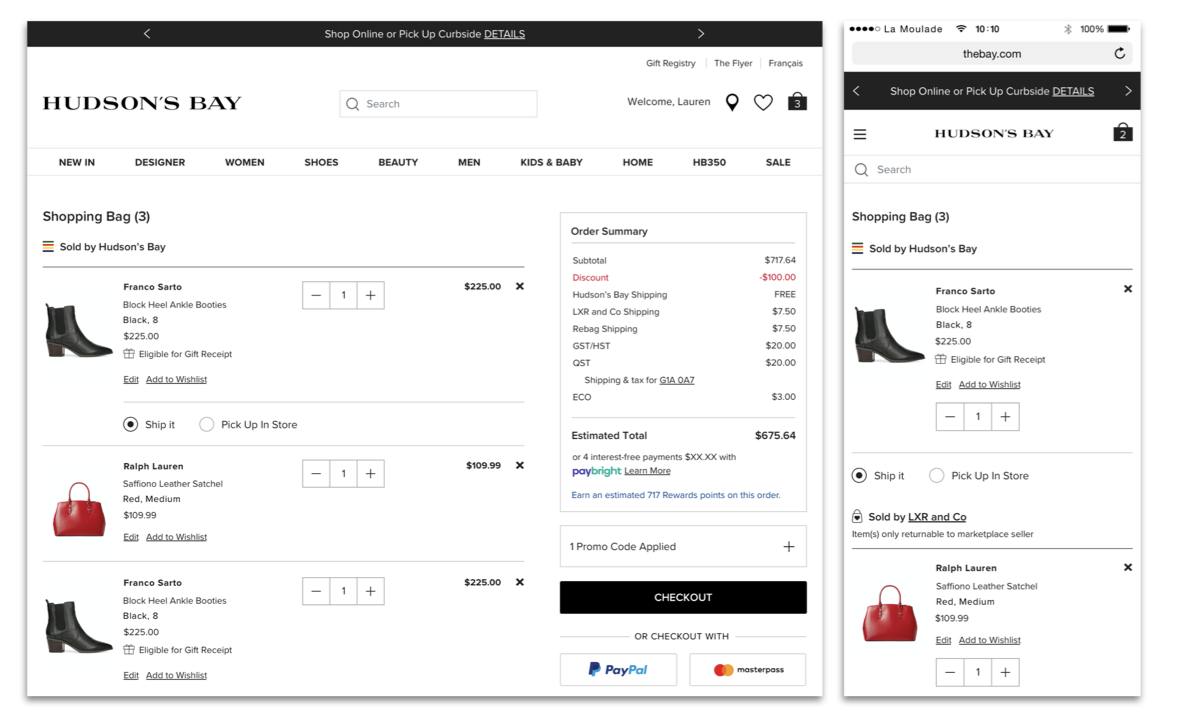
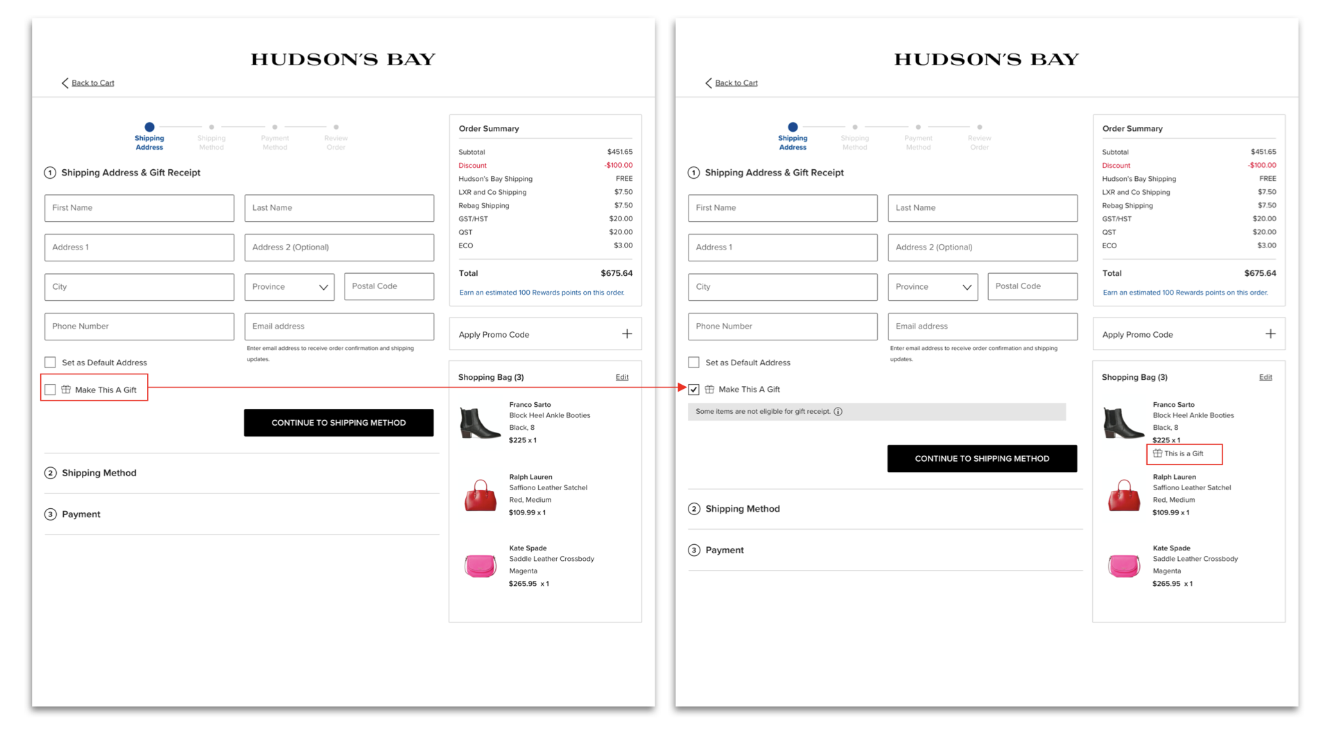
Gift Receipt
Holiday season is coming, and The Bay would like to provide gift receipt for customers who are checking out from the online website. Currently, a gift receipt is only eligible from the retail store. The constraints that we had to think were Marketplace seller items and Dropship items. The project timeline was 1 month to complete all the processes until deploy. To understand the user flow and find the opportunities where to add gift receipt option, I created a blue print to start with.