Olo Pay (2023 - Current)
Olo Pay: Designing for Seamless Restaurant Payment Experiences
Led the design for the end-to-end customer journey and merchant tooling for Olo Pay's in-store payment solution, ensuring visibility and seamless operations.
My primary focus was on the Payment Visibility Dashboard (as seen in your UI) and the Payment Detail Pages, providing merchants with clear, actionable data on transactions, refunds, and disputes. This document will mostly focus on Payment Visibility.
Key contributions include:
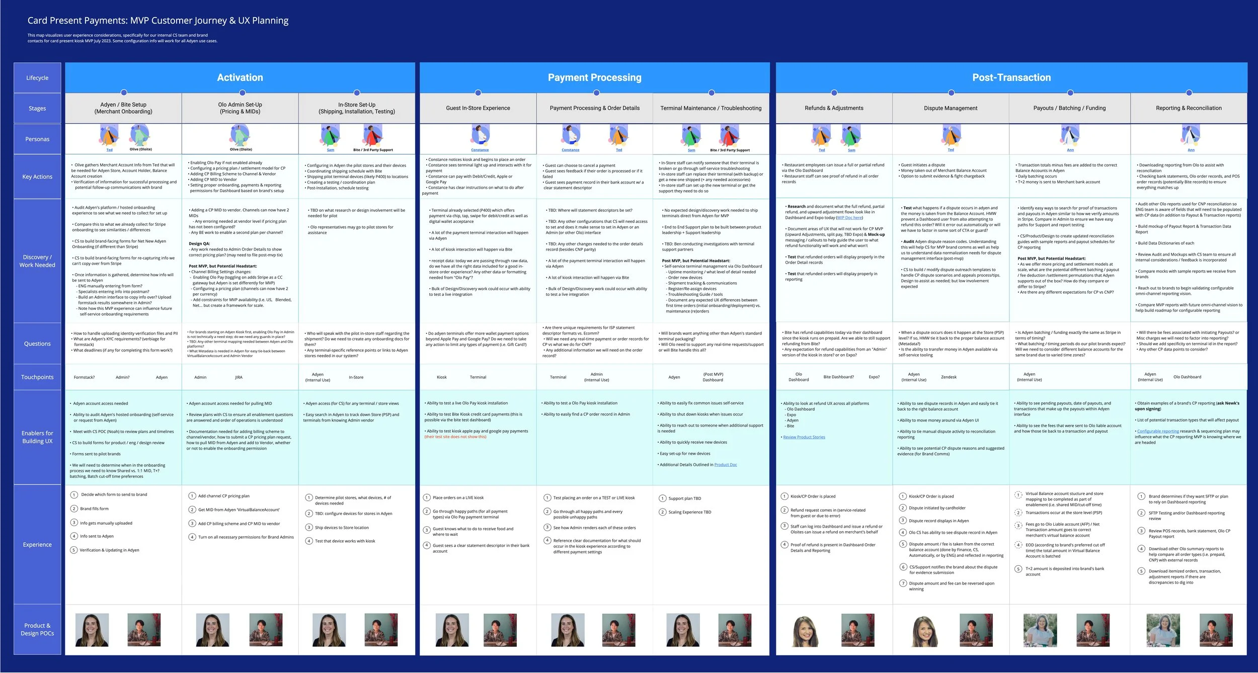
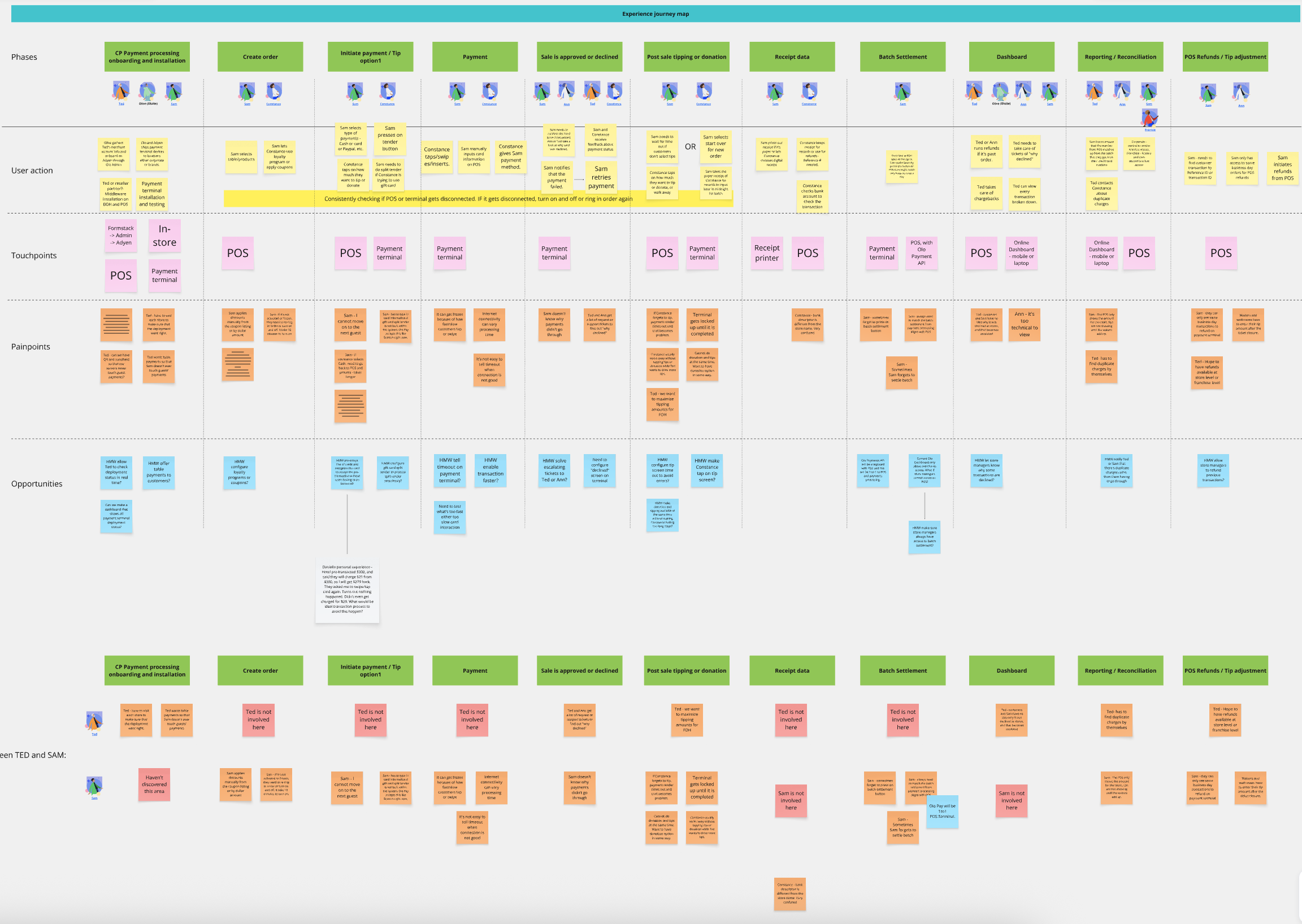
Customer Journey Ownership: Drove the complete UX planning and execution from merchant onboarding (Activation) through Payment Processing and Post-Transaction management, as documented in the MVP Experience Map and updated Experience Map.
Actionable Visibility: Designed the In-Store Payments dashboard to empower merchants to monitor transaction status, date ranges, and payment methods efficiently.
Dispute Management Enhancement: Ensured the design supported clear visibility for complex transaction states, like disputes and partial refunds, streamlining operational workflows for merchants and internal support teams.
Terminals Management: Designed the operational dashboard for merchant staff to monitor the health of the entire terminal fleet (POS and kiosk devices). This included surfacing up-to-date status (Online, Offline, Inactive), device details, and location tracking, which is crucial for identifying and proactively troubleshooting device failures to maintain payment acceptance and minimize downtime.
Role
Lead Product Designer with 3 PMs:
In-Store Payments, Merchant Solutions, Fraud & Foundations
Timeline
Kiosk MVP: 6 months
POS MVP: 1 year
Initiatives
In-Store Payment Table View & Detail Page View
Additional Functionalities: Refund, Void, Adjust
Digital Wallet Support
Reporting & Reconciliation
Enhance CX experience in Admin
Result 1
Enabled and onboarded 900+ locations to manage payments digitally:
Kiosk: 401 locations
POS: 523 locations
Result 2
Reduced support ticket volume by 30% (this is largely due to 0-1 experience) proving that design solved users high prioritized needs
Result 3
Successfully introduced new “In-Store Payments” page to users by feature flag:
357 clicks from Order page since the launch till the last month
-43% clicks from previous month (114 clicks to 65 clicks) - proving users learned new product
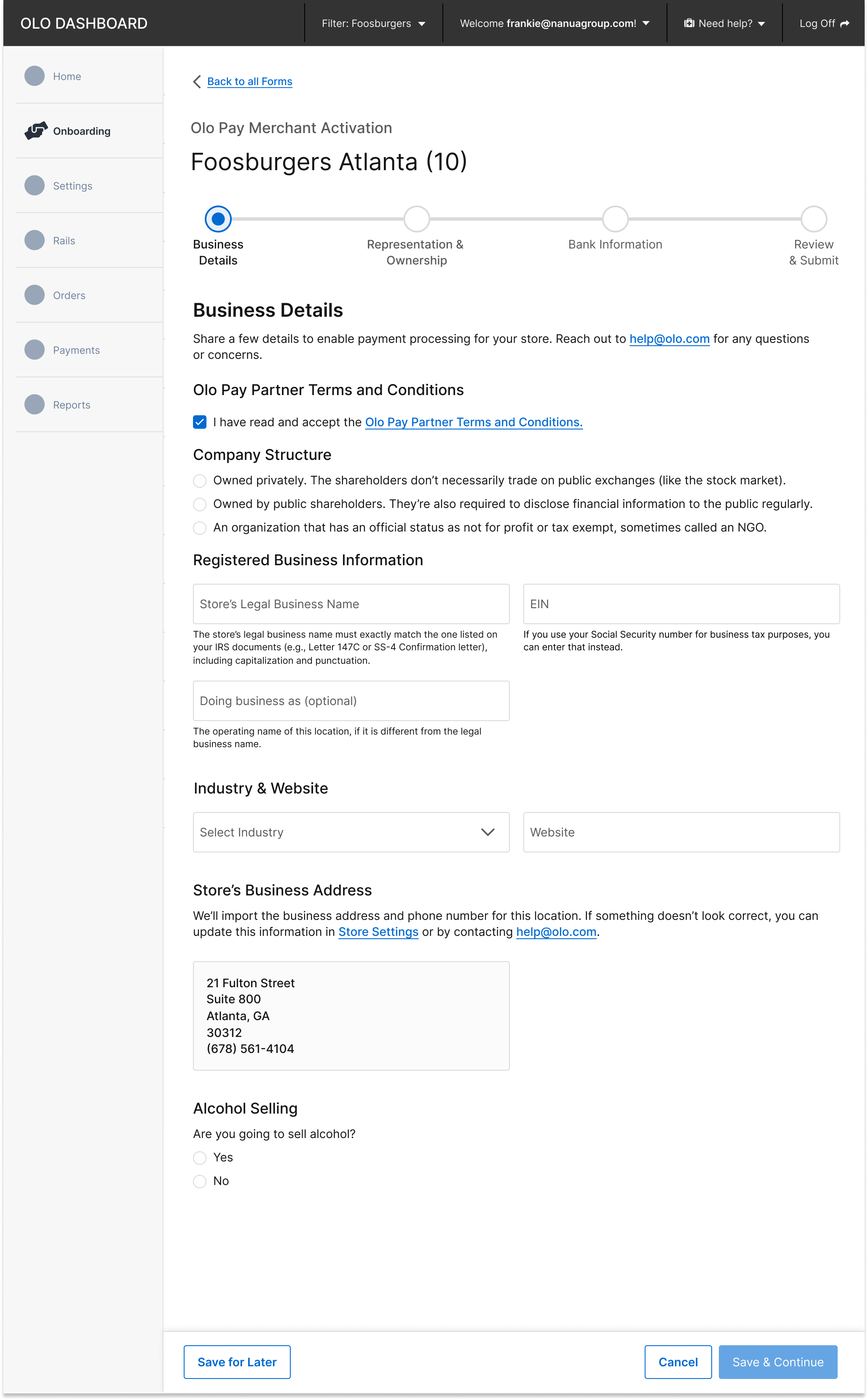
Merchant Onboarding Dashboard Tooling
Worked closely with Adyen and Olo’s legal team to gather requirements and streamline the merchant onboarding process. The goal was to create a seamless experience for merchants by collecting all necessary information upfront, ensuring compliance while minimizing friction. This process aligned operational needs with usability, enabling smooth adoption of Olo Pay's card-present solutions for merchants and CX teams.
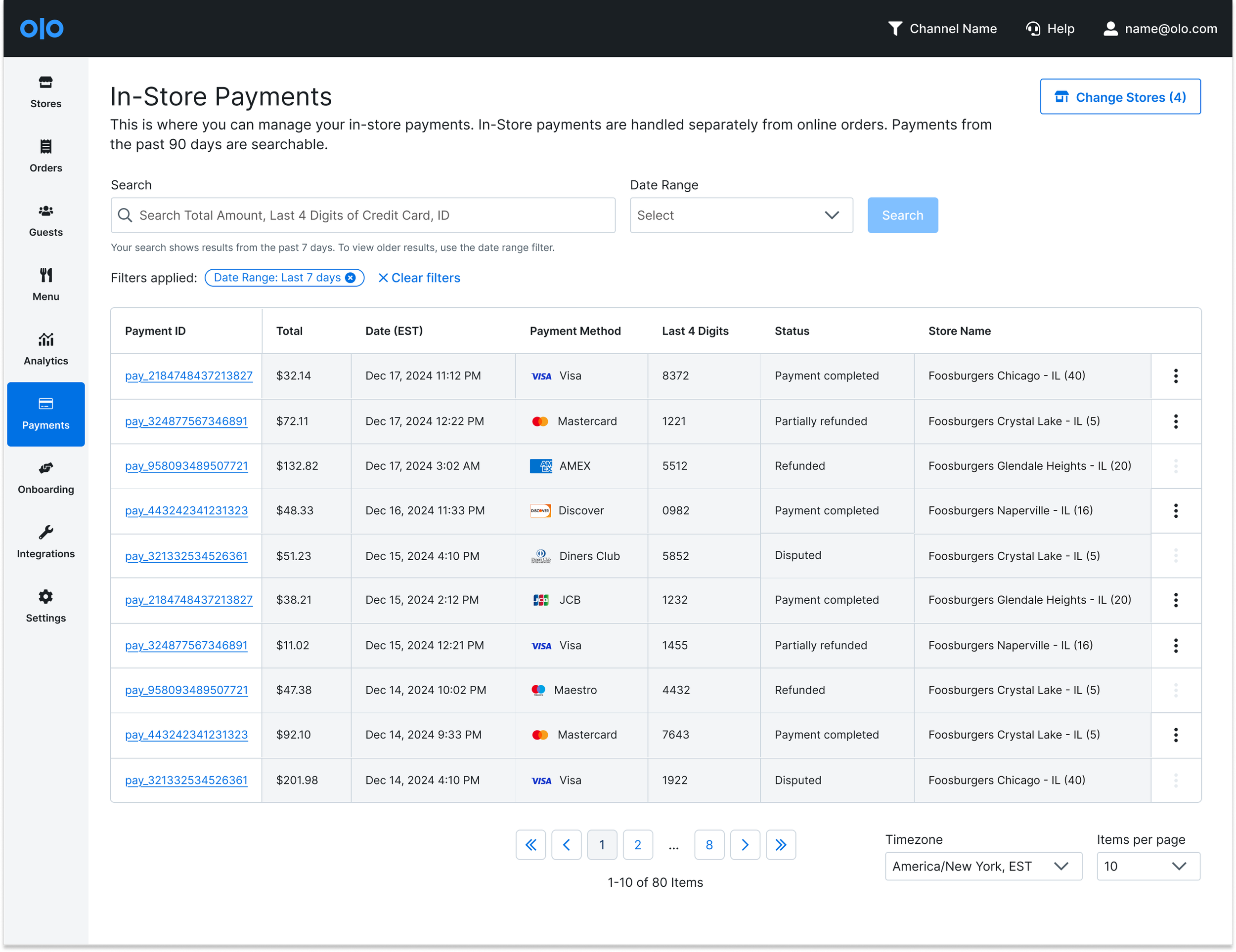
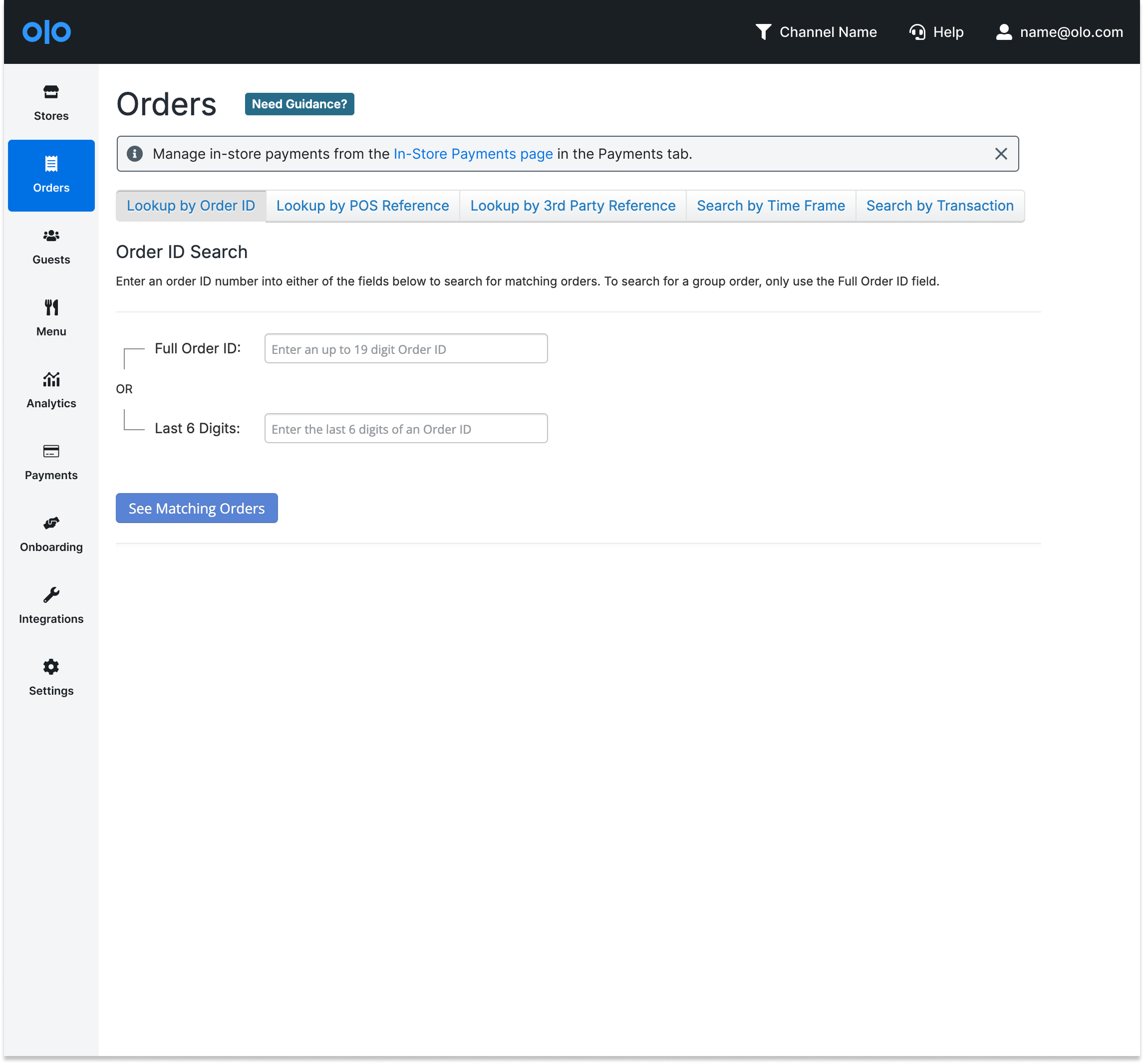
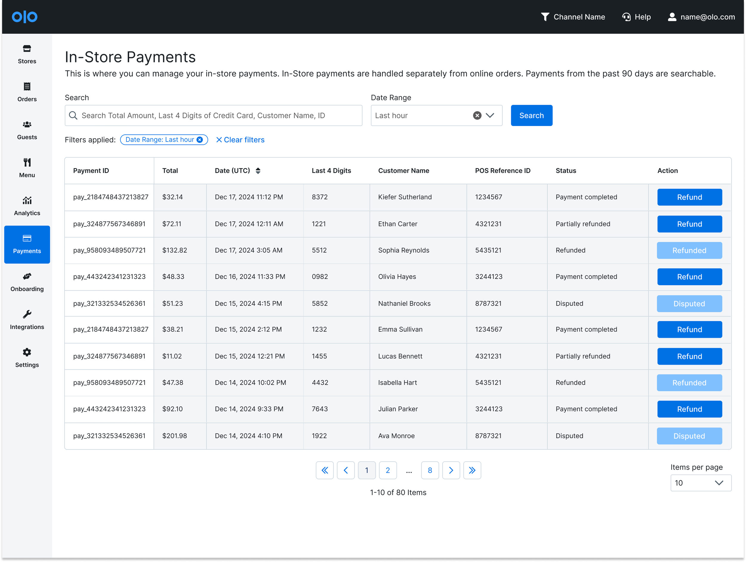
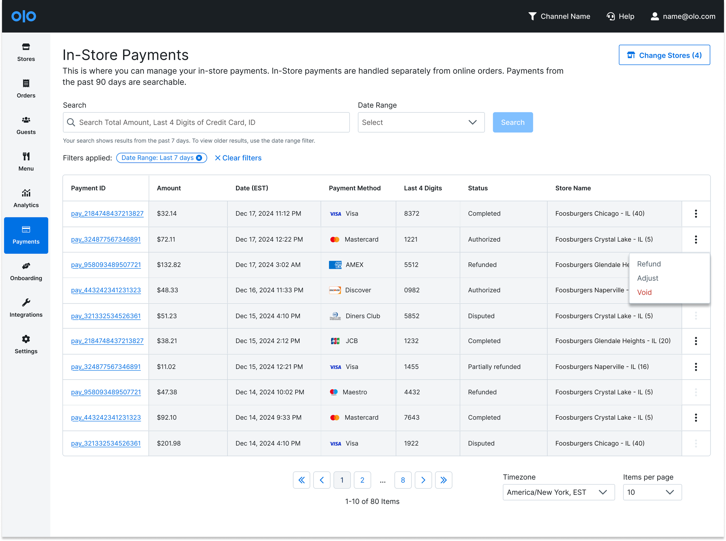
In-Store Payments Table
The view table allows users to quickly search and filter transactions by date range, payment ID, and status. Crucially, it serves as the control center, enabling immediate action: users can Refund, Adjust (partial refund), or Void transactions directly from the interface. By centralizing payment status and control actions, this view significantly reduces manual research time, simplifies reconciliation, and improves operational efficiency for both in-store support and dispute management.
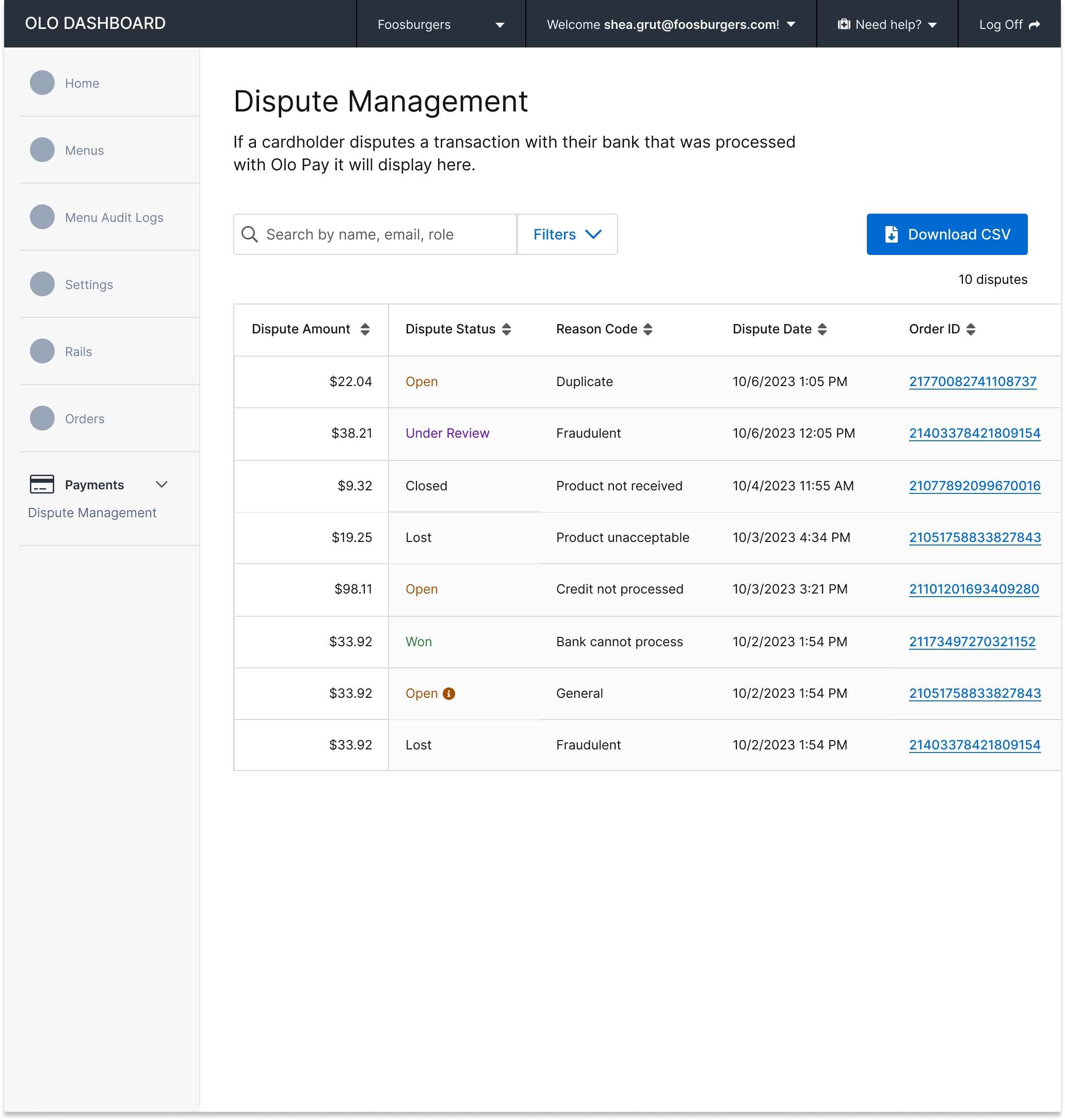
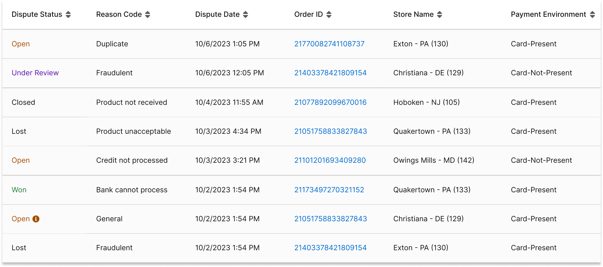
Dispute Management
Worked closely with the Fraud team, Data team, and Adyen to align dispute mapping for card-present transactions with card-not-present flows. Led the complex dispute mapping process with Adyen to ensure accurate categorization of disputes, which would drive automated email notifications to merchants. This solution integrated seamlessly into the Olo Admin platform, providing merchants with timely updates, real-time visibility, and a streamlined dispute resolution experience.
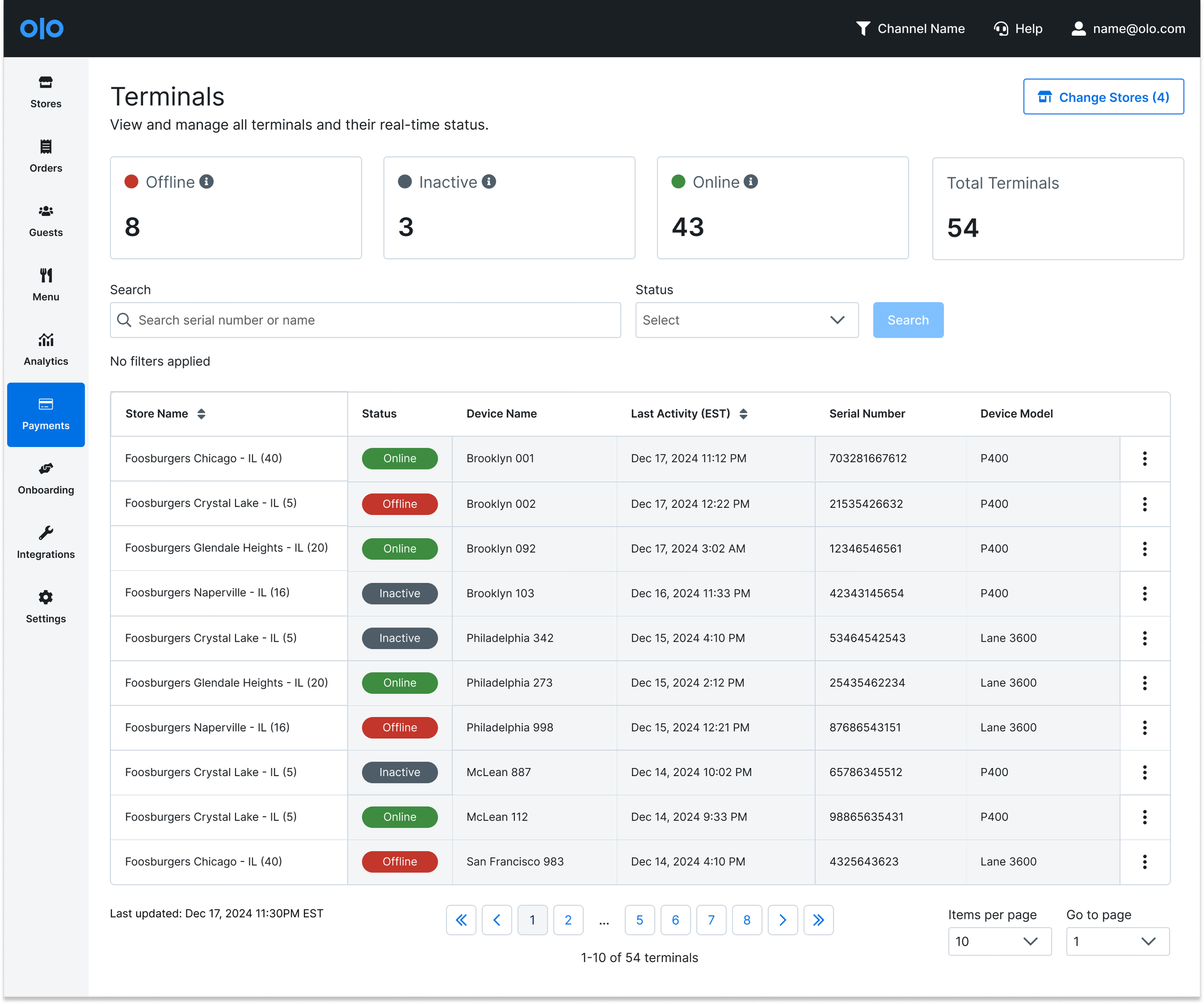
Terminal Management
This dashboard provides up-to-date visibility over all point-of-sale (POS) payment terminals deployed across the merchant's locations. The view features status cards at the top summarizing the recent health of the entire terminal fleet (Offline, Inactive, Online), and the central table allows users to search, filter, and track terminals. By centralizing this data—which is periodically synced from our data warehouse—the dashboard empowers operations managers to effectively monitor and troubleshoot terminal issues, identify potential device failures, and maintain payment system uptime across all locations.
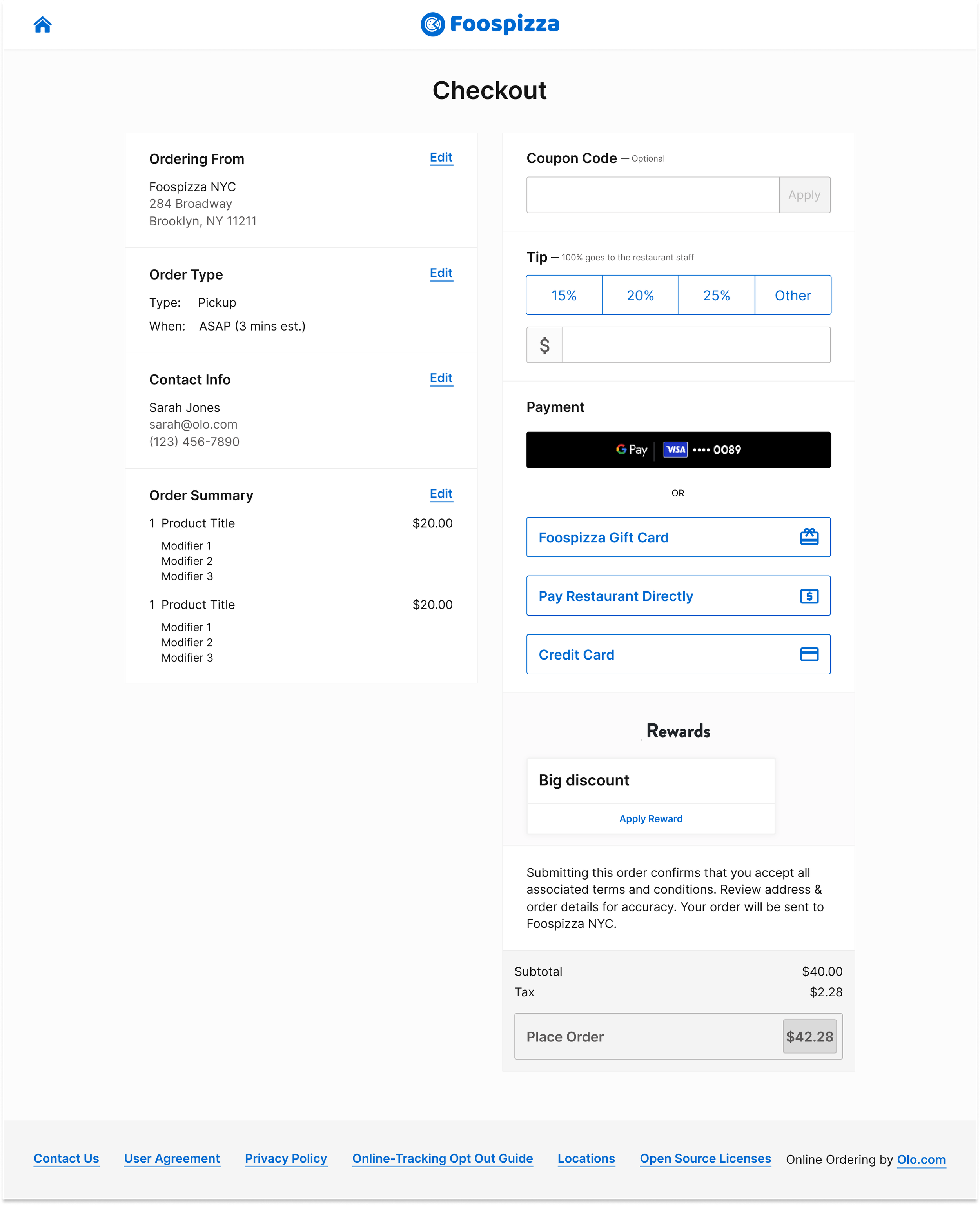
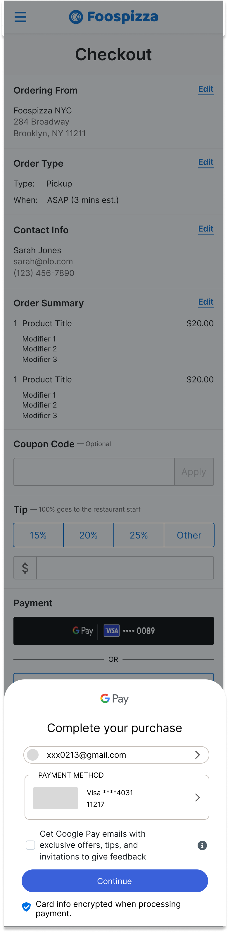
Digital Wallet Integration in Checkout Page
Leading the design efforts for a digital wallet integration targeting customers outside of Olo Pay. This project ensures that Google Pay and Apple Pay buttons are visible at key moments in the checkout process to enhance the consumer experience. From placement on the checkout page to seamless transitions into native payment sheets, the design focuses on usability and clarity. The goal is to streamline the checkout flow, improve conversion rates, and offer a familiar, frictionless payment option for users.
Goal
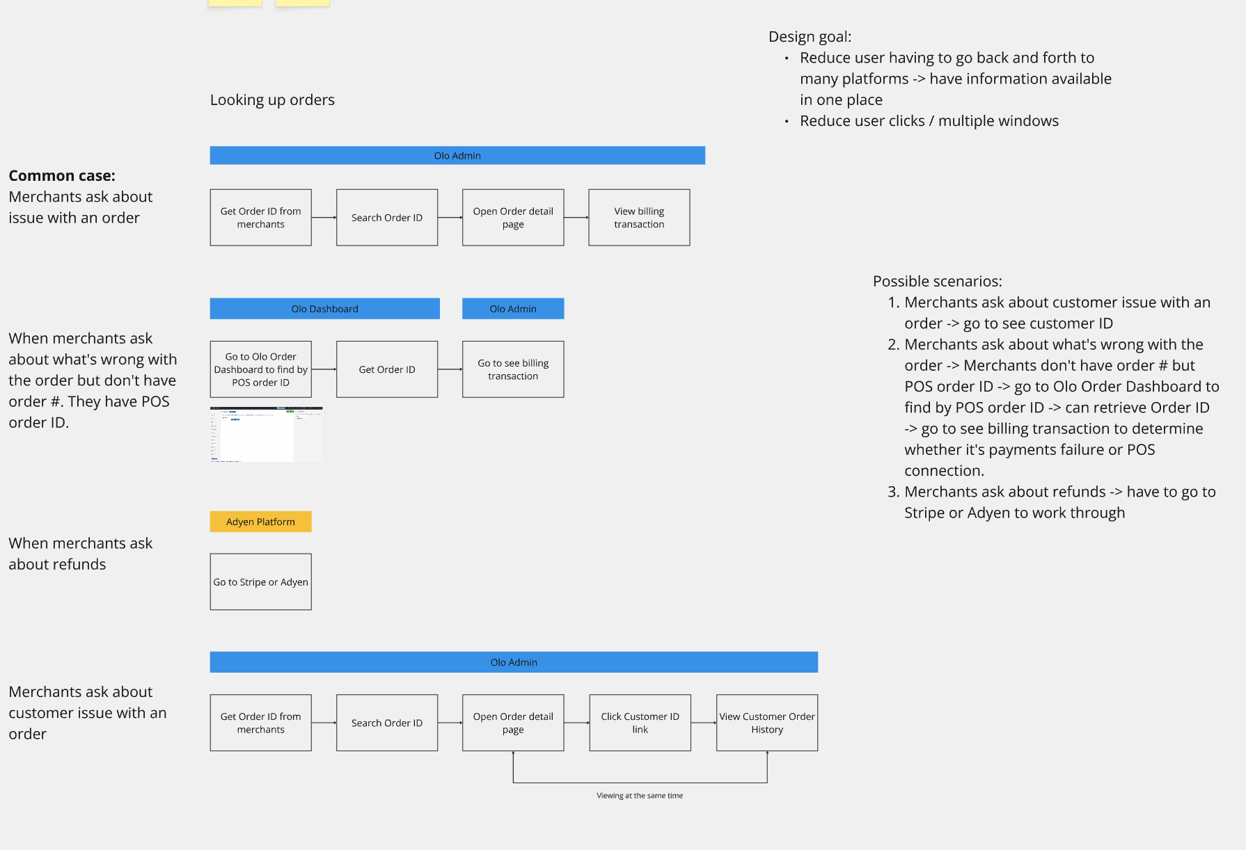
To provide merchants and internal Customer Experience (CX) teams with a single, comprehensive source of truth for all in-store (kiosk/POS) payment transactions, empowering them to manage, reconcile, and resolve payment issues directly and efficiently.
Target Users
Restaurant/Merchant Operations Managers: Responsible for daily financial reconciliation, shift closures, and investigating customer complaints regarding in-store payments.
Internal Olo CX / Support Teams: Service desk engineers or support staff who assist merchants with payment inquiries, transaction research, and dispute escalation.
Problems
Merchants using Olo Pay's in-store solutions lacked a dedicated, intuitive interface to easily track, search, and manage card-present transactions. This forced them to rely on complex external systems or manual processes, leading to:
Problem 1:
High friction: Difficulty in quickly looking up a payment for a customer complaint or accounting purpose.
Problem 2
Operational delays: Inability to immediately perform critical actions like Refunding, Adjusting (partial refund), or Voiding payments.
Problem 3
Inefficient Dispute Handling: Lack of clear visibility into payment status (e.g., disputed, refunded) slowed down the dispute management and reconciliation process.
Initial HWM:
HMW design the internal Admin visibility tool to not just view data, but to support essential operational tasks (e.g., generating reports, audit trails, linking related disputes) that are critical to supporting the merchant payments lifecycle?
Our failure and learning:
During the MVP development for the In-Store Payments solution, a strategic decision was made to initially limit the scope of transaction visibility to our internal Customer Experience (CX) teams only.
The Rationale: We assumed that our CX team could handle the initial, low volume of support inquiries by looking up transactions internally, while we focused our engineering resources entirely on building the core payment processing and merchant onboarding features. We believed merchant-side visibility was a "nice-to-have" for Phase 2.
We quickly moved to a cross-functional whiteboarding session led by me involving the Engineering team to vet the proposed solution. This collaboration revealed a critical truth:
Engineering Constraint: The proposed design would require an unanticipated level of complexity on the back-end (e.g., requiring a complete overhaul of the transaction API or demanding extensive processing time that would severely degrade system performance).
This early collaboration helped to come up with the decision to kill the idea immediately.
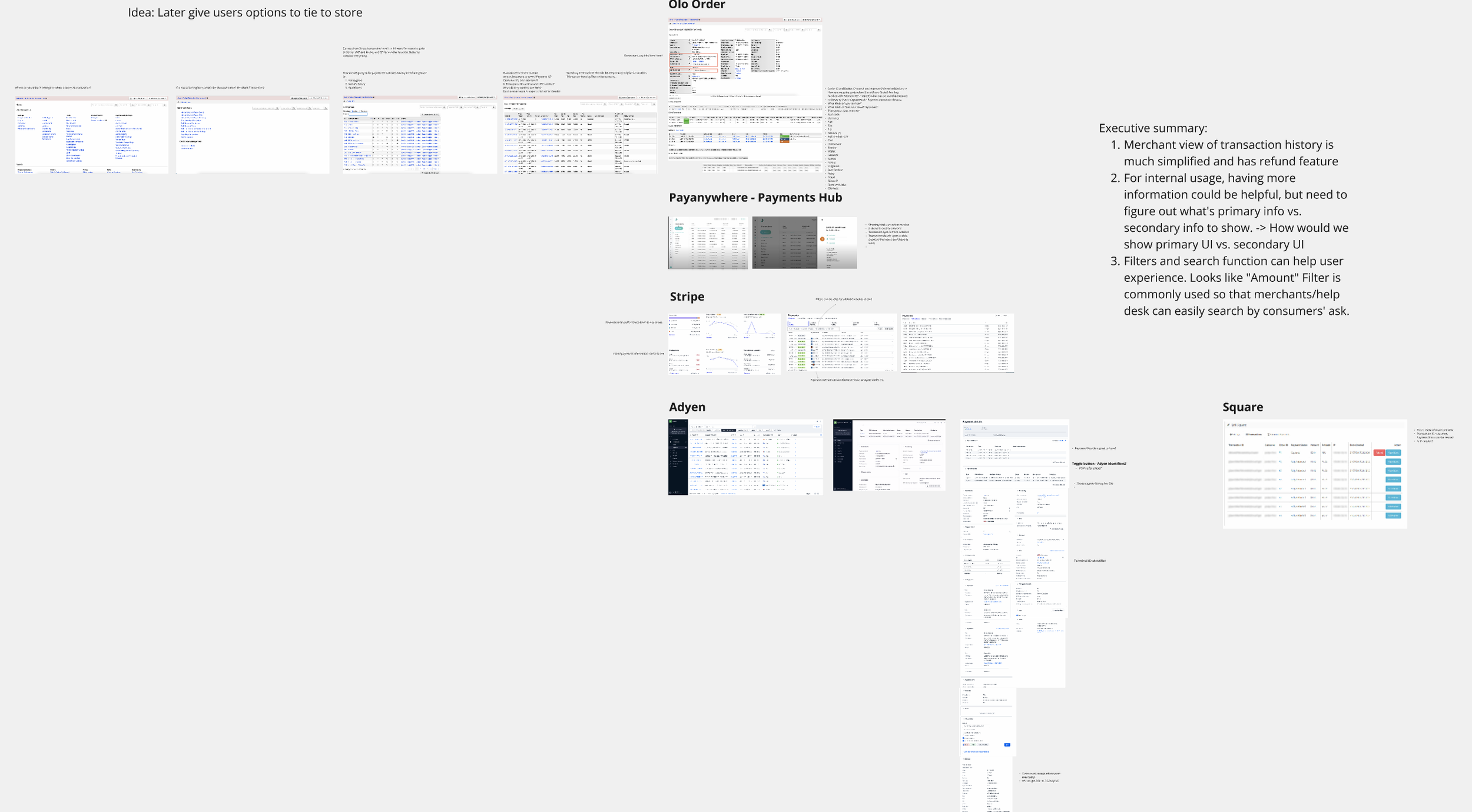
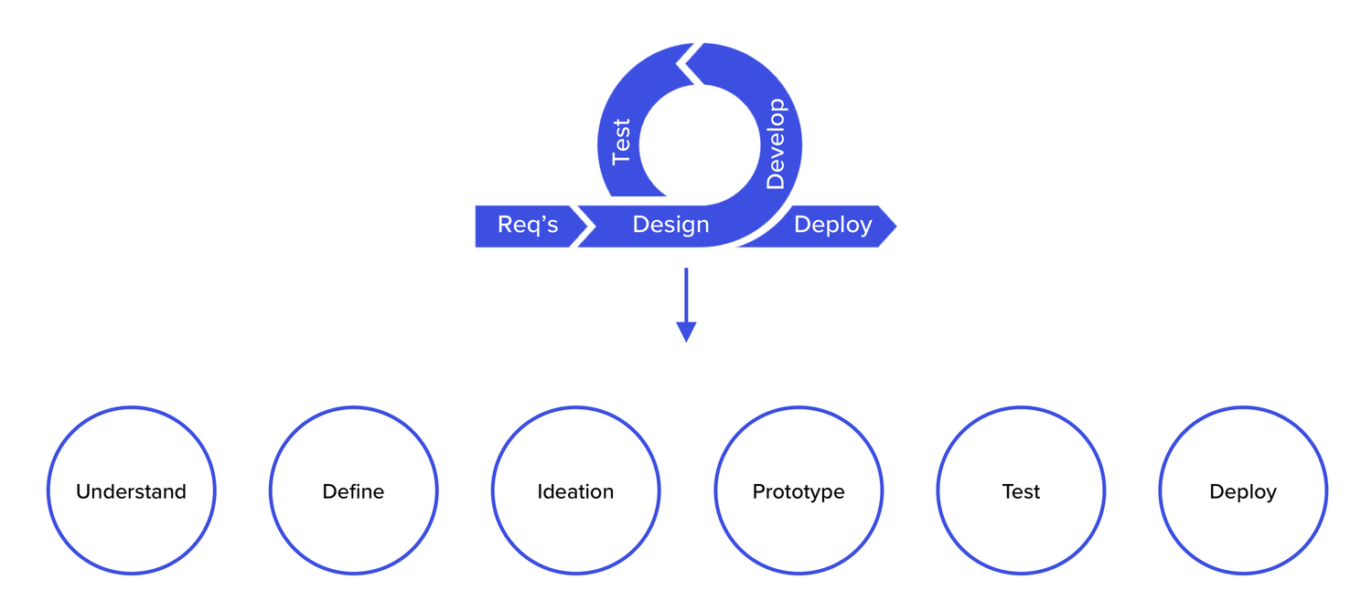
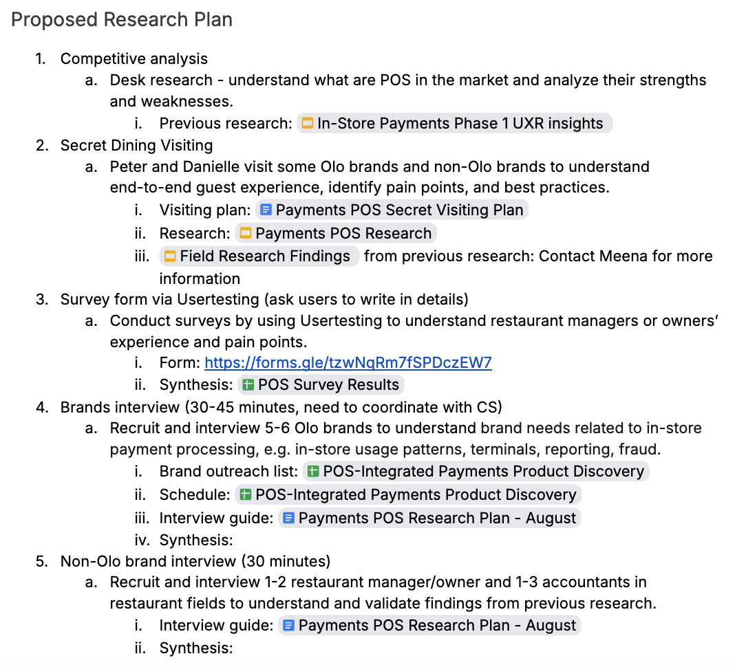
Competitive Analysis & Current Design Audit
What were done before killing the idea?

User Flow - Implementation Team
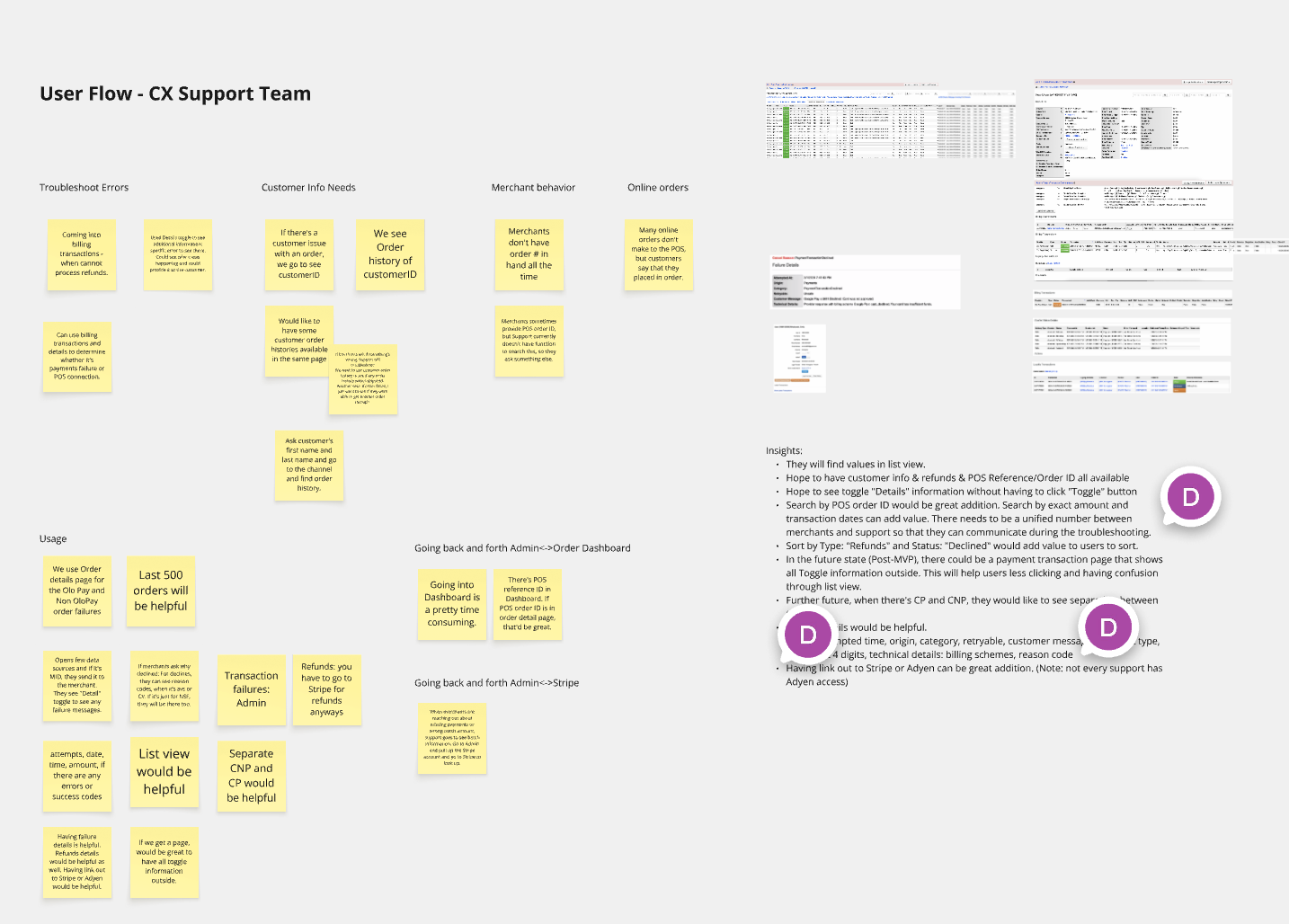
User Flow - CX Support Team
Find User Needs and Biggest User Impact
Strategic Pivot: Driving Business Strategy through User Research
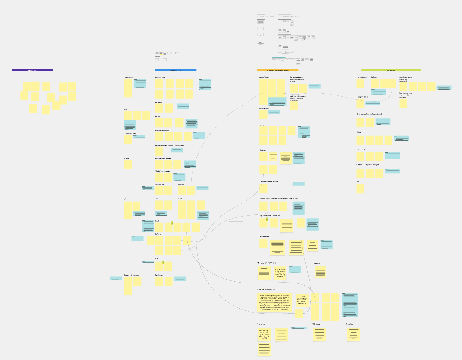
Facing budget constraints that eliminated the dedicated UXR team, I volunteered to lead the research effort, arguing that strategic product decisions required evidence, not assumption. My proposal involved stepping back to execute a comprehensive user research plan to draw the actual experience map of current users dealing with payment issues. This research was pivotal: it clearly identified that the greatest operational friction occurred on the merchant side, not the internal support side, which was the opposite of our initial assumption. The compelling data collected from merchants allowed us to re-define the target user from internal CX to the Merchant Operations Manager, justifying a complete overhaul of the business roadmap and prioritizing the development of merchant-facing self-service tools like the Payment Visibility Dashboard. This initiative proved that investing in user understanding was the most efficient path to product success.
Proposed dedicated user research to step back
Initial user needs:
We found our merchants need “Refund” feature
In order to provide “Refund” feature, payment visibility is needed to reduce errors and increase conciseness
Therefore, design proposal began from minimal data table view of payments with refund functionality
Begin with User Flow
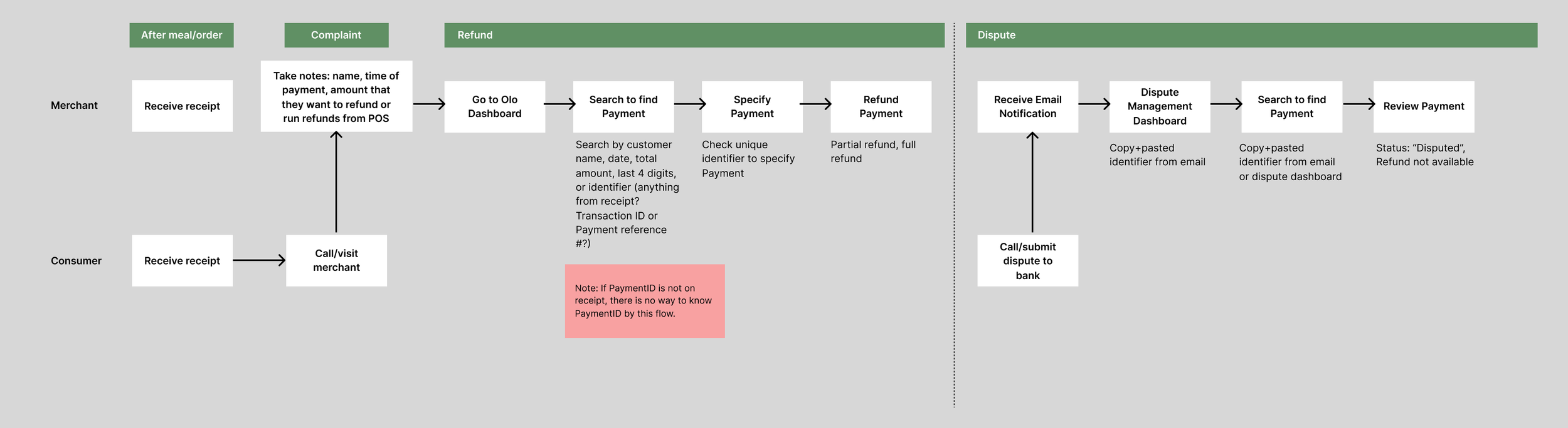
With the previous user research, user flow was created to support understanding of difference between Refund and Dispute. This helped team to focus solely on refund but also was able to invite Fraud team to provide any conflicts that we had to be mindful of Disputes.
Starting from Information Architecture
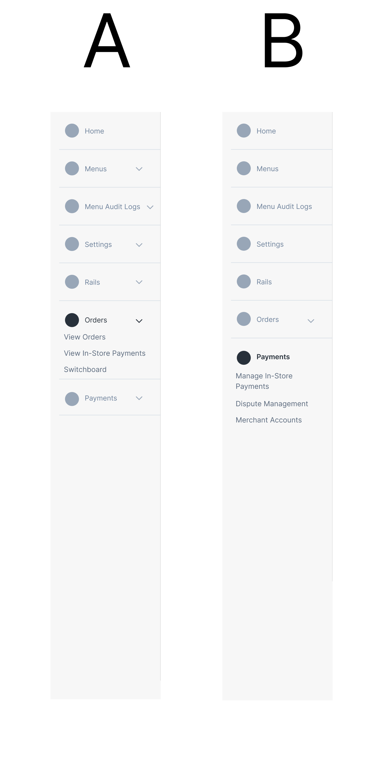
The current Olo users (merchants) are used to go to Orders tab to view payments details. This is due to technical constraints that Olo Order is tied to Olo Card-Not-Present through Stripe. However, Card-Present is a pure payment which is not tied to Orders. Challenge was to decide between Orders vs. Payments to fit Payment visibility.
Test Results: Olo users all selected Orders because of current behavior, but Non-Olo users all selected Payments because that’s how they are using outside Olo platform.
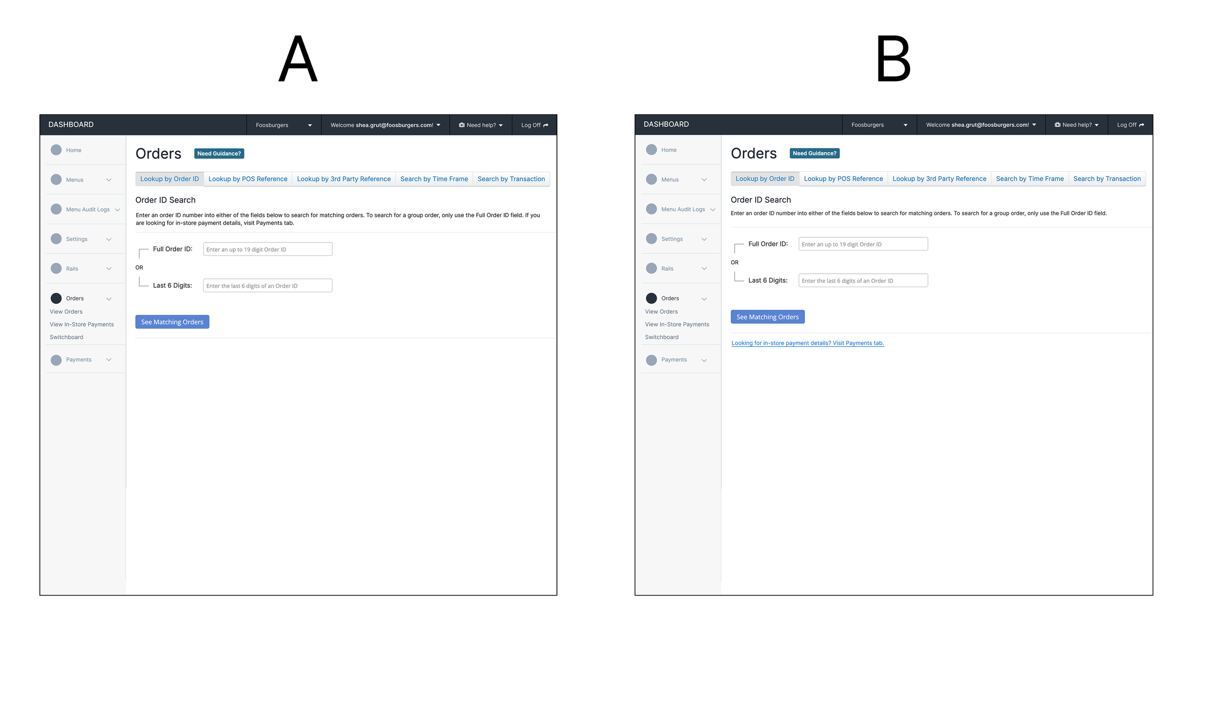
Design Decision and another test
We’ve decided to go with ‘Payments’ tab although we have to take users’ learning curves. This will ensure we align with market standard and to scale our Payments area instead of hiding under Orders concept. Since we only wanted to introduce this in the beginning for our users’ learning curve, we wanted to minimize the design. Test A is embedded in the sentence describing In-Store Payment visilibility is under Payments. Test B is to display hyper link under Orders.
Test results: 6 Users out of 6 users selected hyper link because it’s clearly visible.
IA Decision
Since this is supposed to be few times learning curves, we’ve decided to use the alert message with “x”. This allows users to close out once they feel it’s not needed.
This was added to Mixpanel to track:
357 clicks from Order page since the launch till the last month
-43% clicks from previous month (114 clicks to 65 clicks) - proving users learned new product
V0
I’ve made design proposal to begin with minimal data table view, a filter, and refund functionality which was most needed by merchants. From the user research, users mentioned that they’d like to have Date Range filter, so it was added for the MVP.
Design decision on Action button: Why Refund button is too prominent?
Refund is the first action we’d like to introduce
Train users to know Action CTA buttons will be on the right side
From the user research, merchants come to the dashboard mostly for Refund
Train users to learn when refund is “available”
Flow 1:
A user lands on the In-Store Payments page. The user can either search or refund payments.
Flow 2:
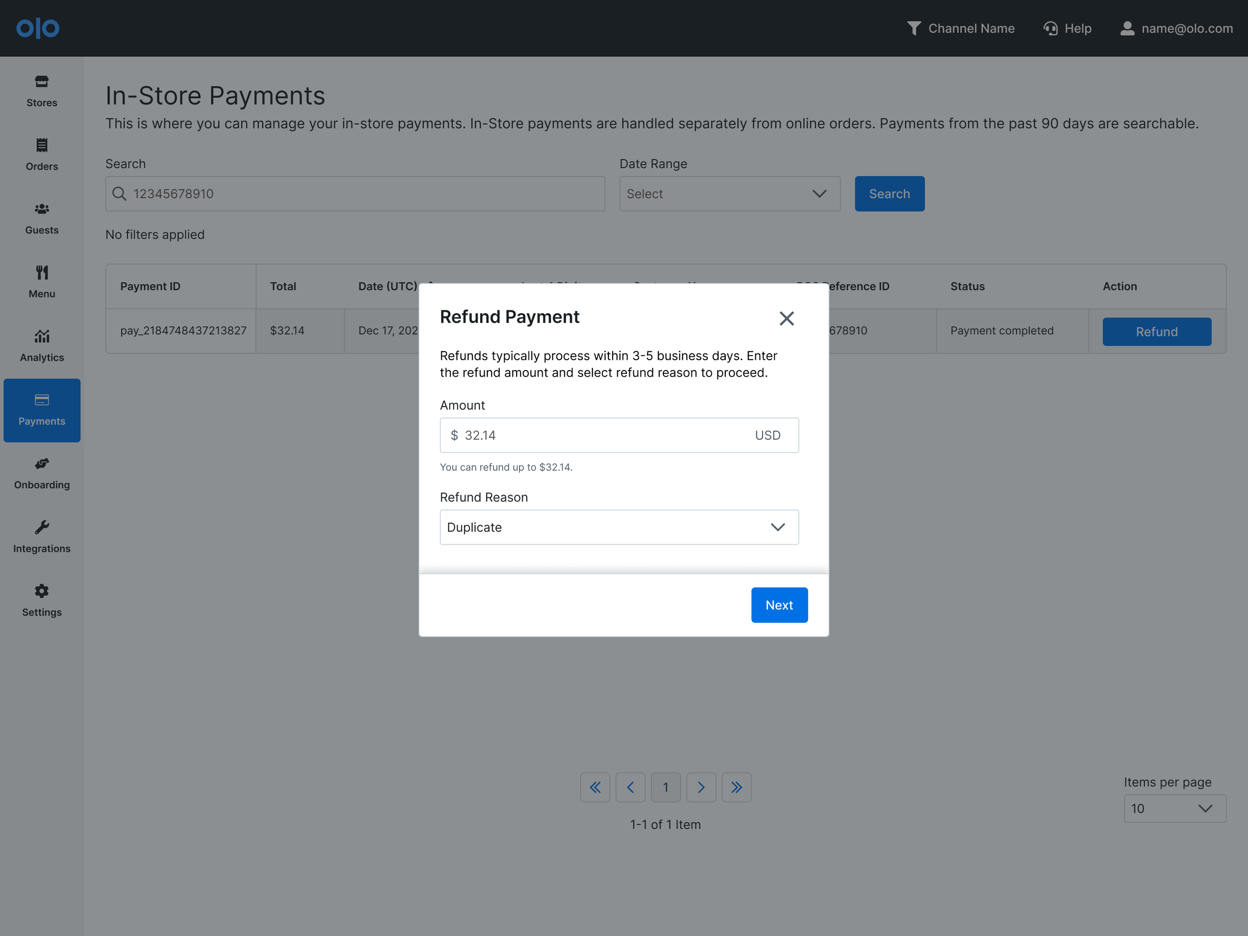
When a user clicks the Refund button under the Action column, the user will view the pop-up modal. A user will be able to see maximum number they can refund and select Refund Reason to view in the future.
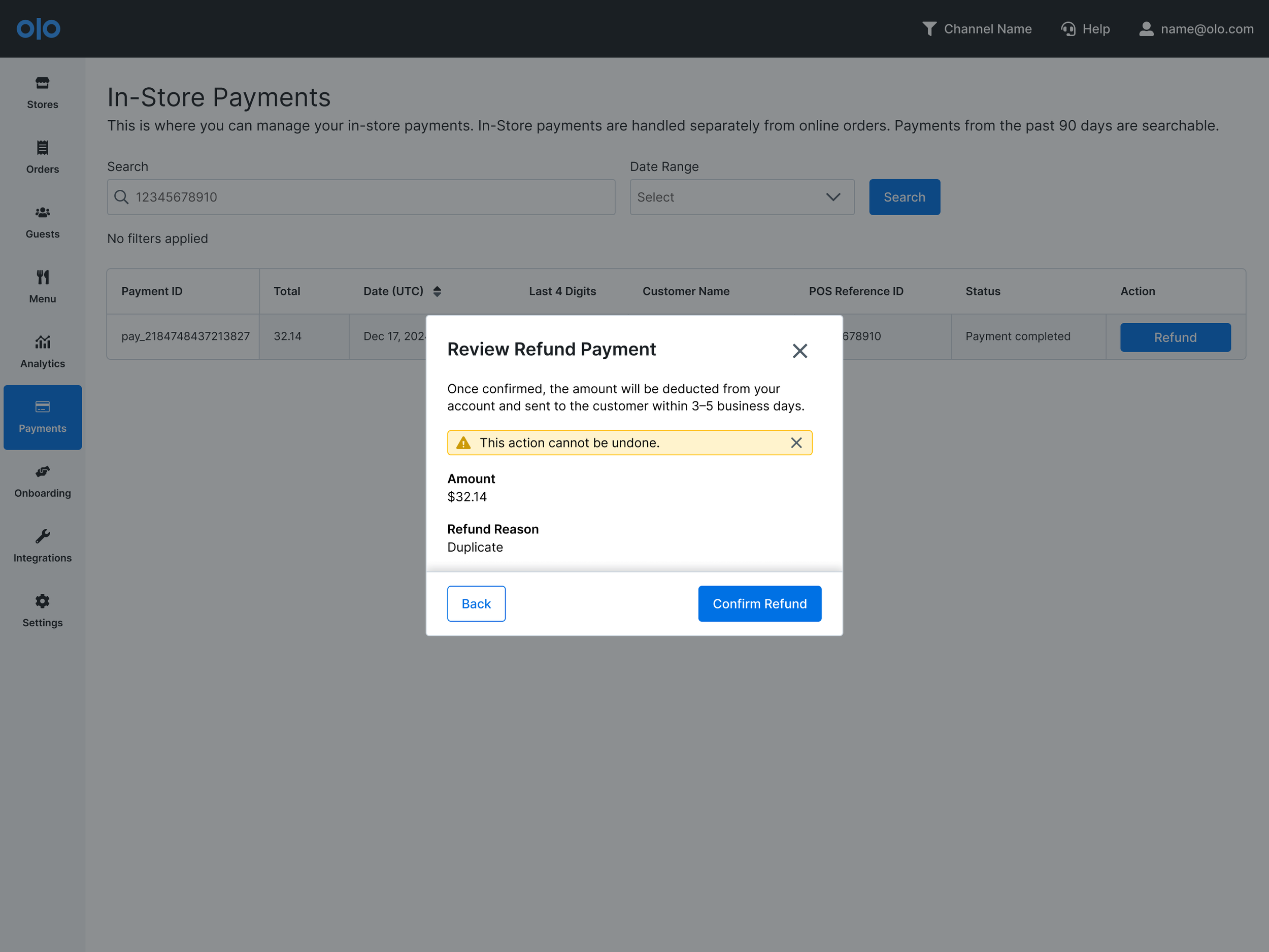
Flow 3:
Since this is about the money movement (highly sensitive in payments), double confirmation modal will help merchants reviewing their numbers. Alert message will ensure this cannot be undone.
Flow 4:
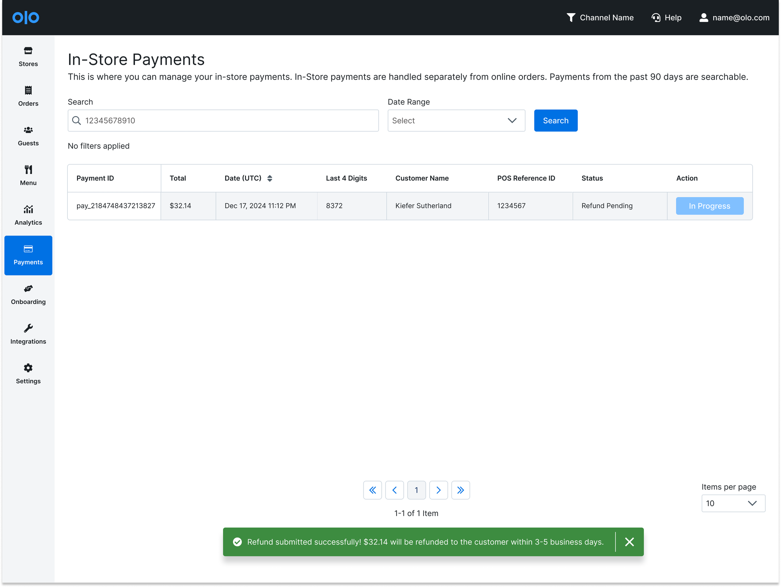
A user will see a successful or an error toast message. The Action button will become inactive with “In Progress”. If there’s a remaining amount, the button will still be active.
Edge Cases
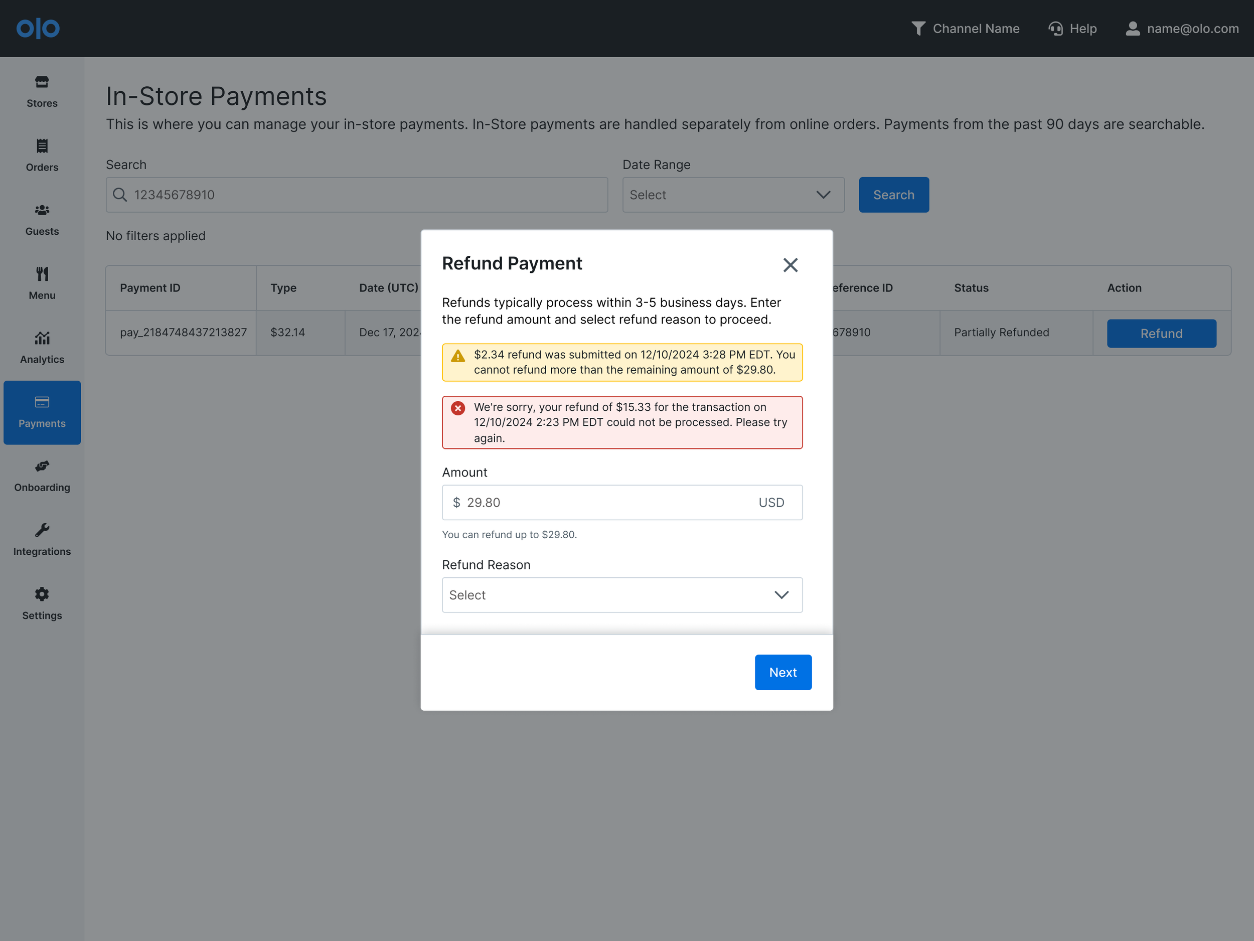
There are some edge cases to handle:
When there’s an error from the previous refund
Refunds were made several times (partial refunds or due to an error)
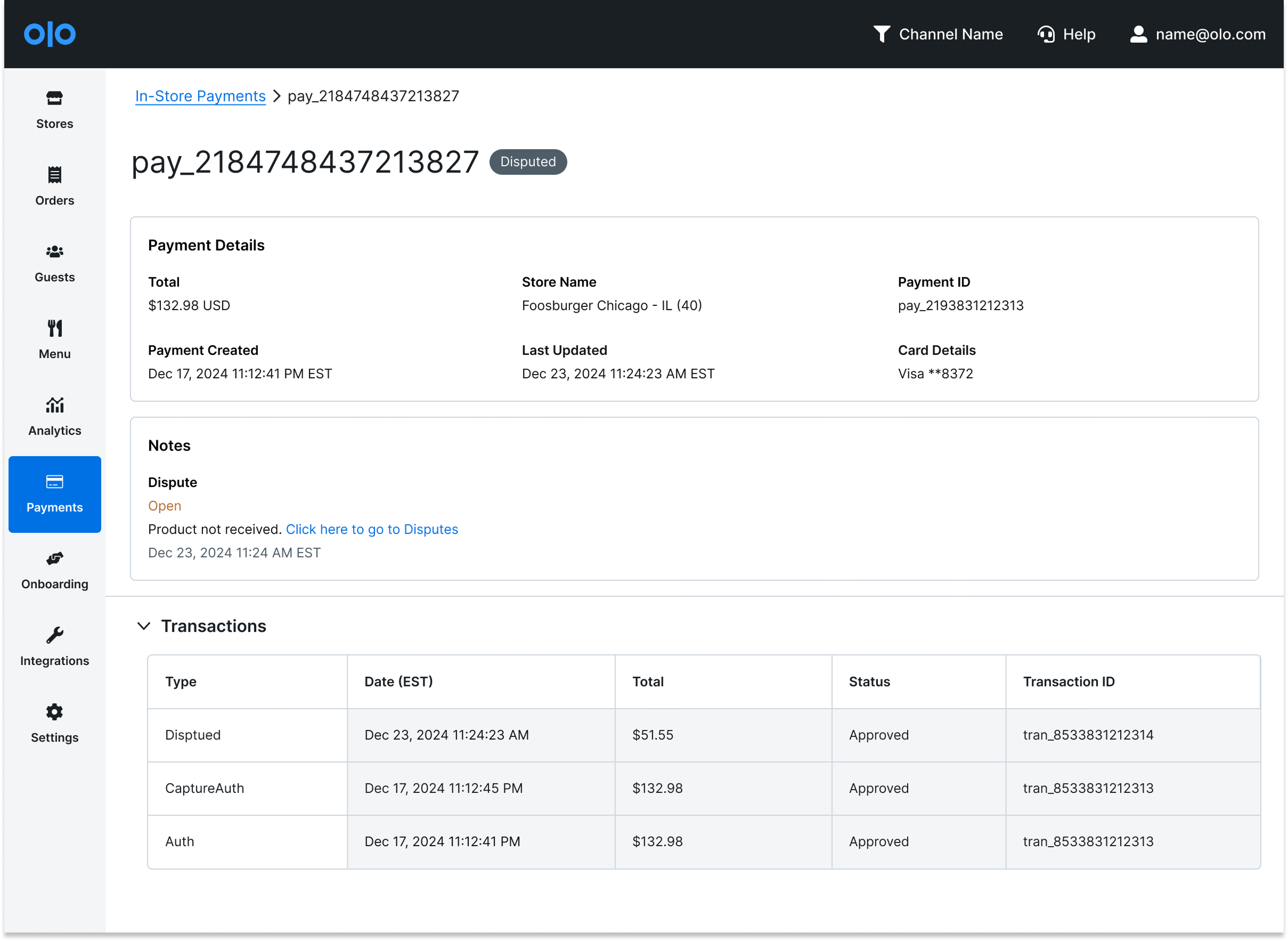
When there are more than one attempt, the toast message will be stacked to let them know the progress. The most recent one will go to the top as aligning the table view. The modal is providing more information due to lack of detail view in MVP. The payment detail page is built for V1 after MVP and it will be explained below.
V1 - Iterations as Scaling
Some changes were made after MVP launch:
Customer name providing availability was unknown before launching: it’s not available so we removed.
Change Stores selector addition: To align with Disputes Dashboard experience, store (location) selector as well as column is added.
Refund button became “…” more feature button: There are more features our team is adding such as “Adjust” and “Void”. This also helps to reduce real-estate.
Payment Method is added with icons: User tested with three options. A - payment methods with icon. B - No icon. C - icons with last 4 digits combined. 4 users out of 6 users selected Option A that they liked having Last 4 Digits and Payment Methods separately for reconciliation purpose and future filter addition.
Payment ID becomes hyper linked to Payment Details page.
V2
Payment detail page is added to support detail view for transaction history as well as when a payment was created & when a payment was updated. From the research, the timeline view is helpful for merchants to troubleshoot with customers but not needed all the time. Therefore, this came to V2.
Fast-followed: Notes sections was added to provide more details about Refund, Adjust, Void, and Disputes
Validation 1
Onboarding initiative was not added in this page, but with MVP onboarding and table view addition, we were able to onboard 900+ locations to Olo Pay Card-Present. This metrics was collected by Looker.
Validation 2
Our goal was to come up with a hypothesis with:
How to minimize operational cost and which user journey we can reduce the most. We’ve found support area can be reduced most impactful by impact vs. effort matrix. Upon adding features, we almost didn’t receive support ticket other than implementation.
Validation 3
Created Mixpanel strategies with all the features we launched to track users’ success to their goals:
How many users initiate refunds by clicking “Refund”?
How many users come from Orders page to In-Store Payments page?
How many users click Payment ID to view more details?
How many users use which date range filter?
Result 1
Enabled and onboarded 900+ locations to manage payments digitally:
Kiosk: 401 locations
POS: 523 locations
Result 2
Reduced support ticket volume by 30% (this is largely due to 0-1 experience) proving that design solved users high prioritized needs
Result 3
Successfully introduced new “In-Store Payments” page to users by feature flag:
357 clicks from Order page since the launch till the last month
-43% clicks from previous month (114 clicks to 65 clicks) - proving users learned new product
Final Thoughts & Learnings
In the beginning of the project, we’ve made a mistake to begin designing first from Admin view to make alignment. This was not waste of time because I was able to learn how to strategize design and product, and also I was able to grab research results to build better product for next round. Stepping back also helped our business unit to spend more time on research to fully strategize as a business. We were able to come up with a new design process to make alignment as soon as possible and the whole team saw the power of research.
Without this experience, our team would’ve stayed longer with start-up mindset which is “start first and fail as soon as possible” which we still have, but became more strategic with better plans.
When I started this initiative, AI was not existing. However, ChatGPT came out and V0 design tools came out quite quickly. I was able to use these to come up with robust design process. My next step is to explore more with AI tools to come up with faster design process with “Start and fail”. I love “Start and fail” design process since this proves idea with data and help to provide leadership level insights. V0 (tool) helped us removing Wireframing step and that’s something I’d like to keep testing.