Re-design (2022)
Intersection Co – Fleet
Intersection is an experience-driven Out of Home media and technology company that delivers programming, consumer amenities, and advertising to cities. It is backed by Alphabet – its urban technology company Sidewalk Labs.
Fleet management enables service desk and site reliability engineers to troubleshoot and keep tracking of our digital screen health. It has all the troubleshooting functions through Broadsign and also Datadog. Intersection not only provides digital experiences to the city but also manages screens by Fleet after the installation. Fleet management was originally designed by the engineering team without a designer, so many functions are not intuitive and user focused.
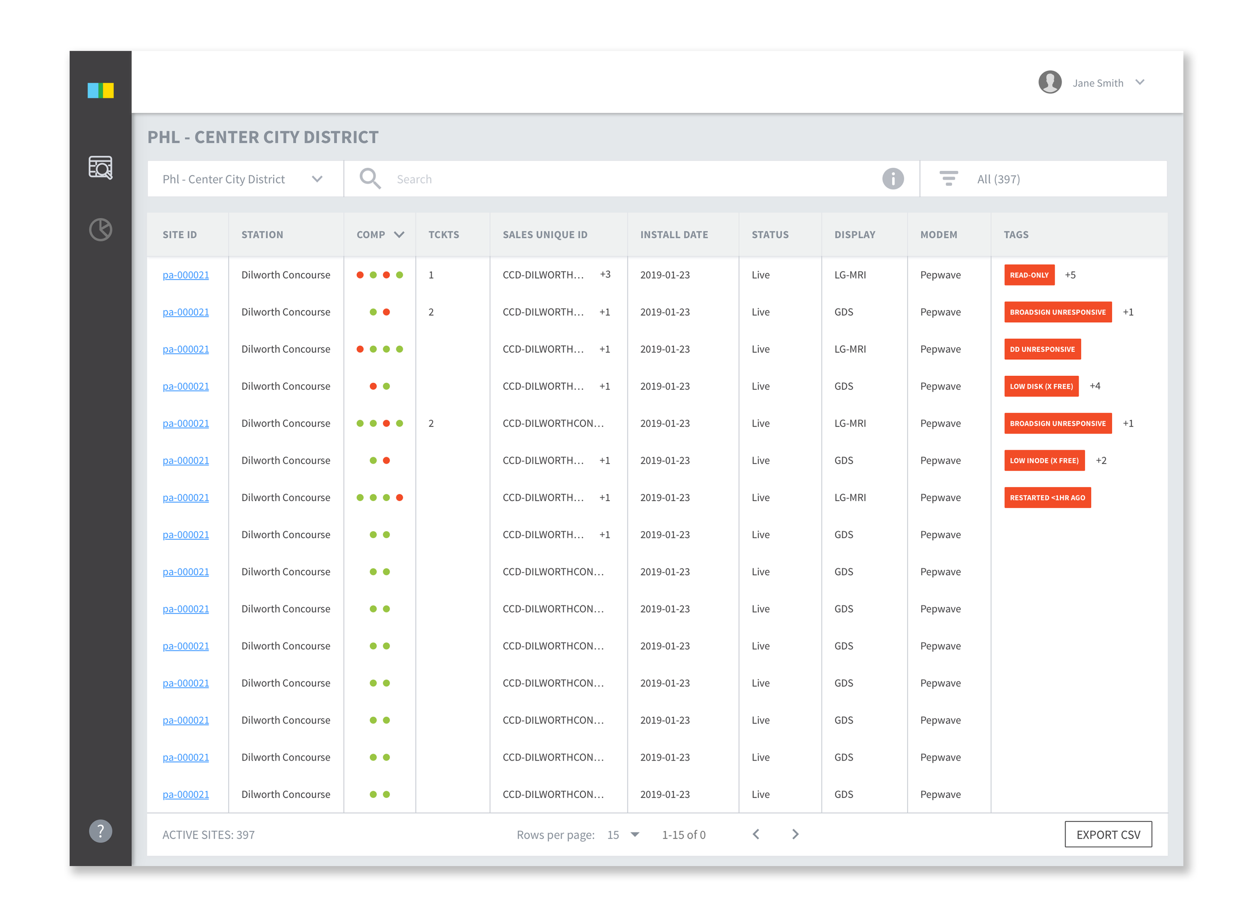
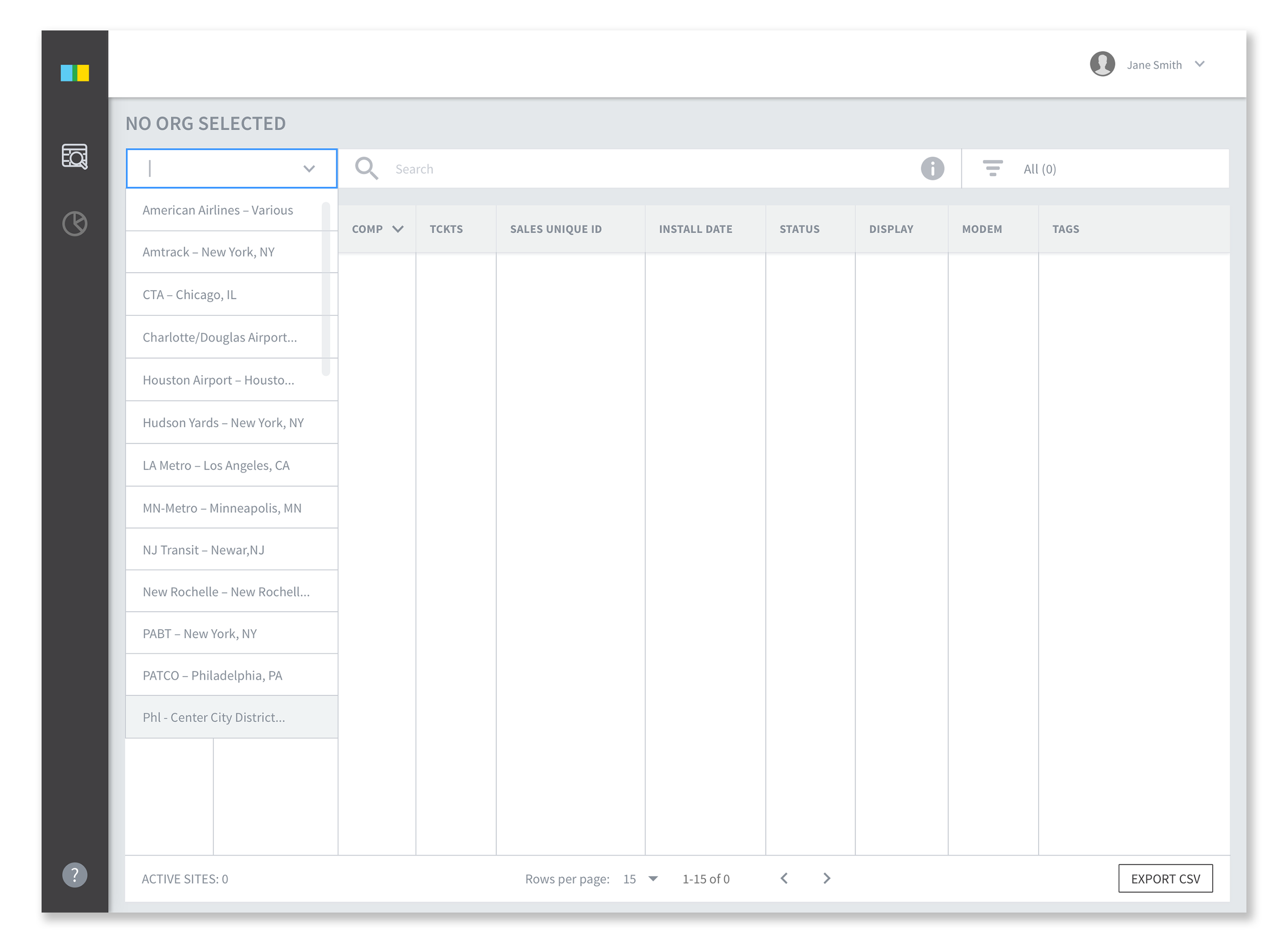
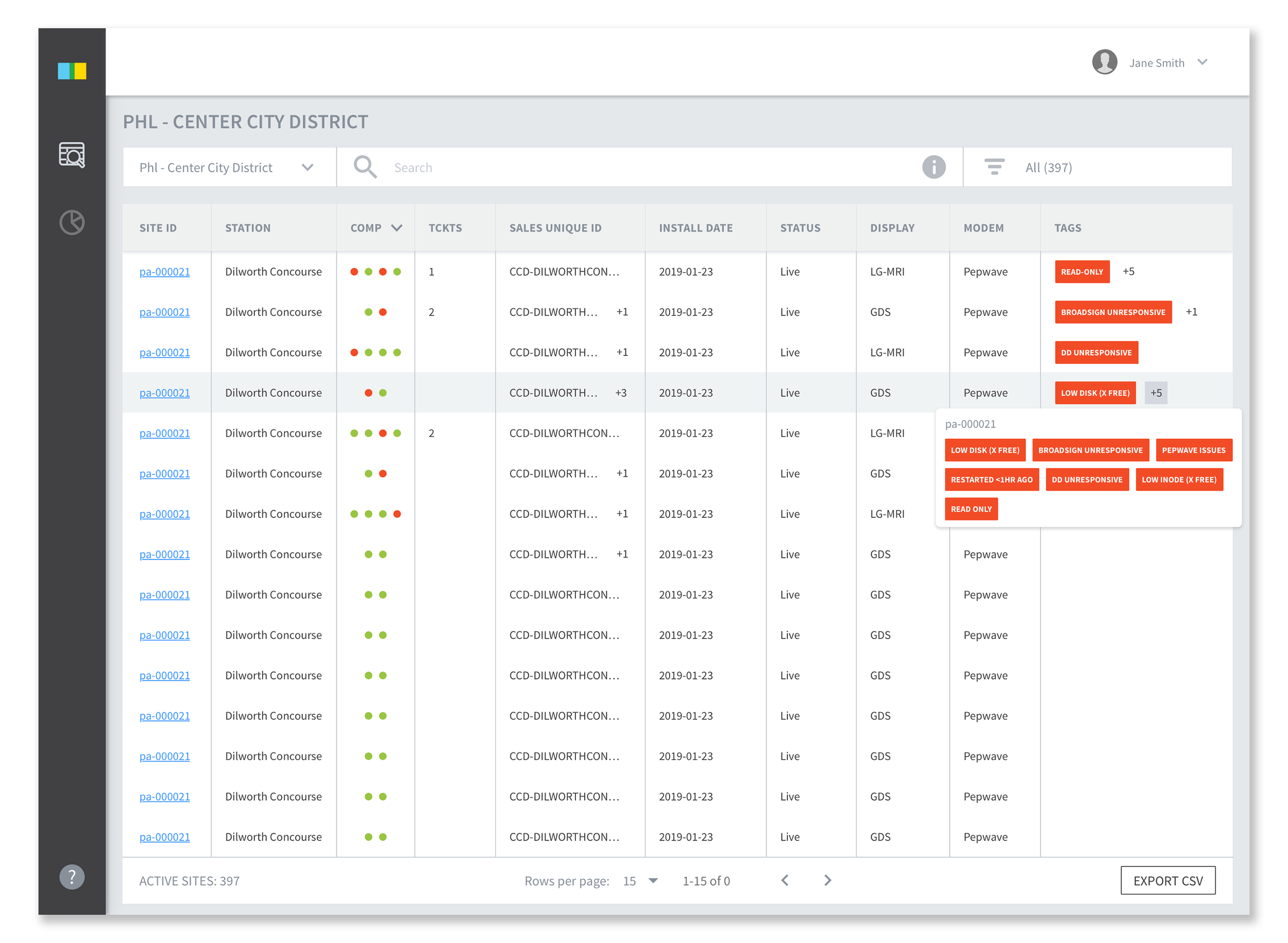
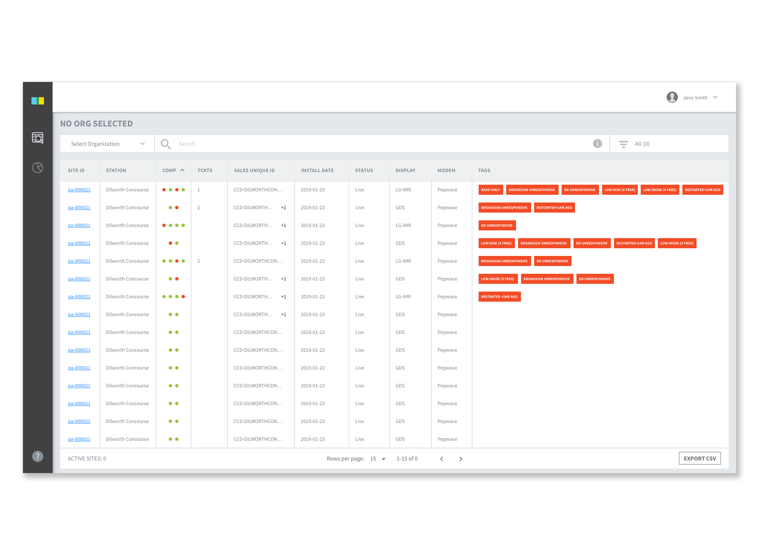
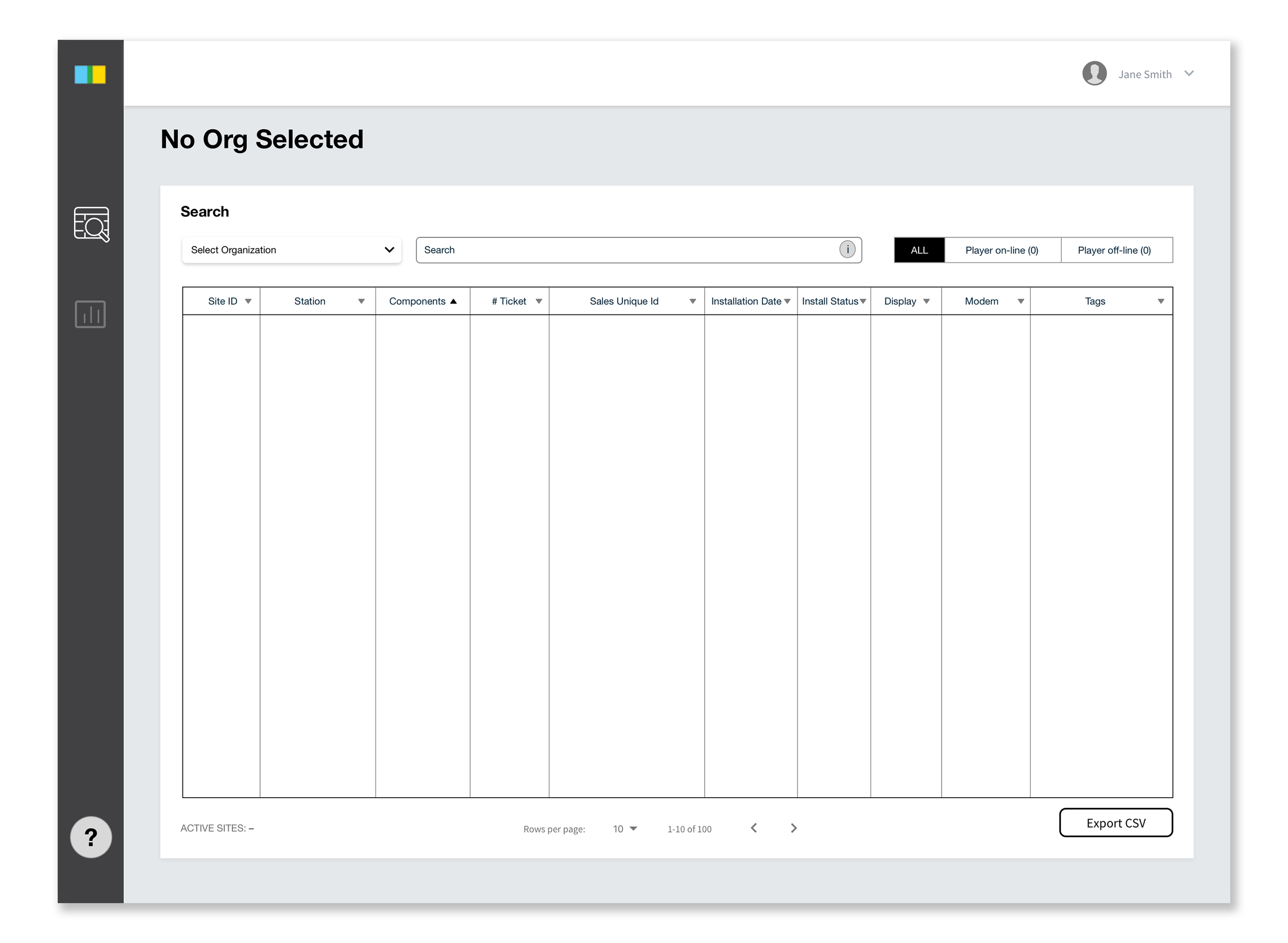
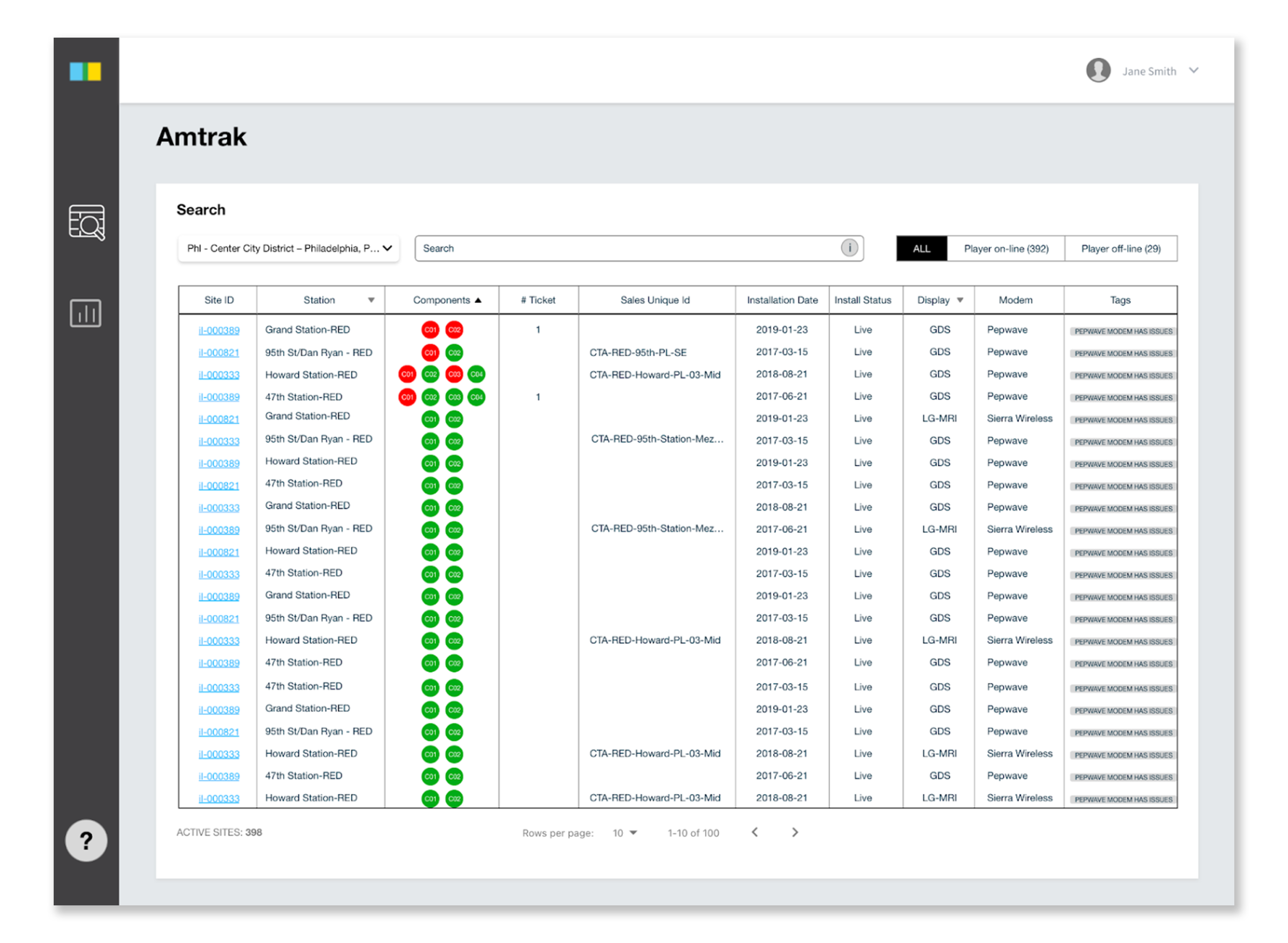
Table Search
Users can search by selecting organization. Red component dots are organized by default, so users can see the sites with errors first.
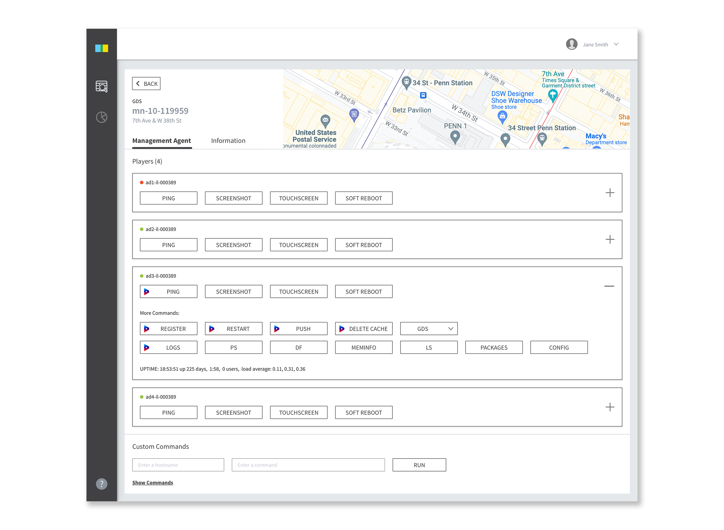
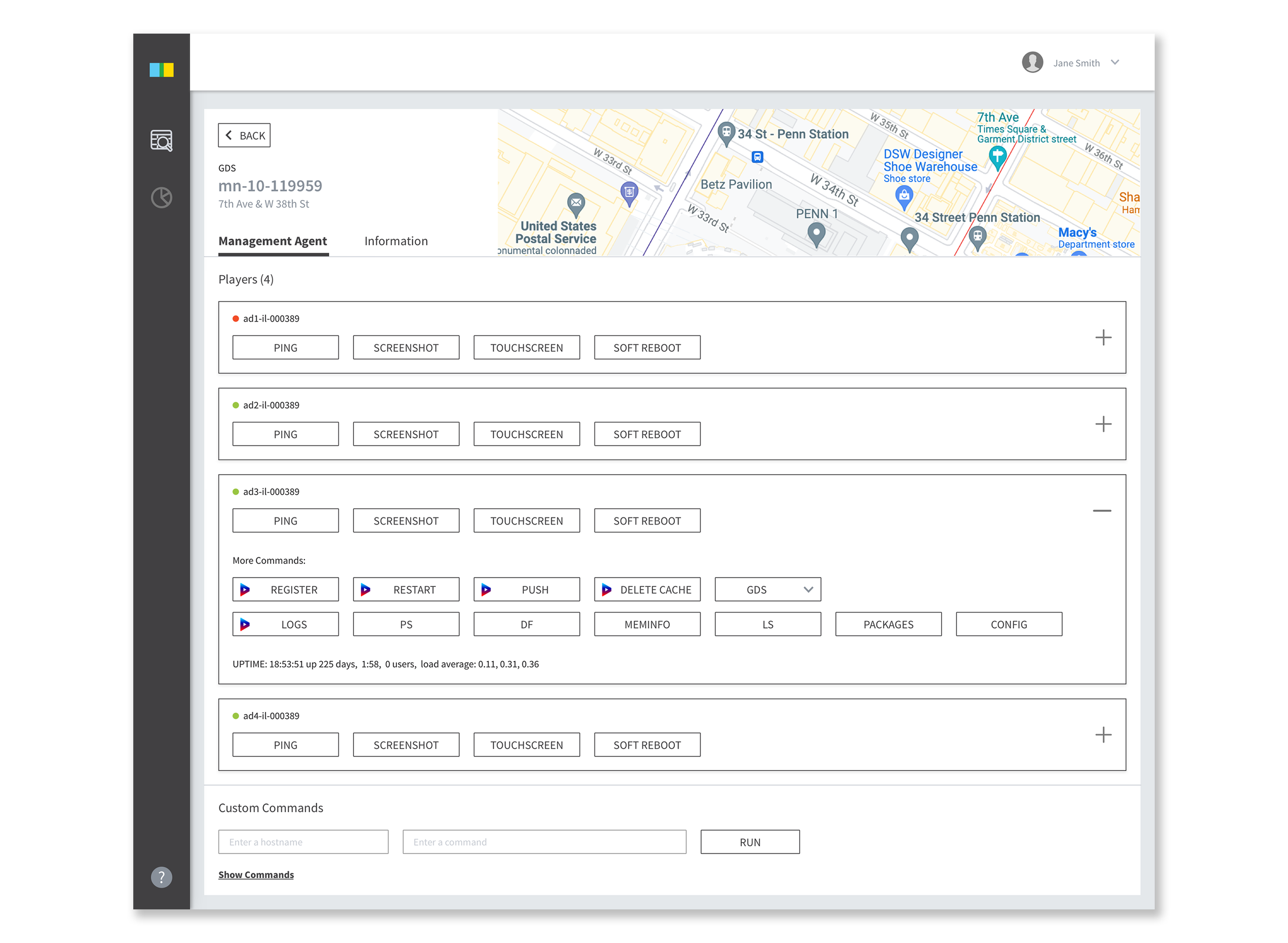
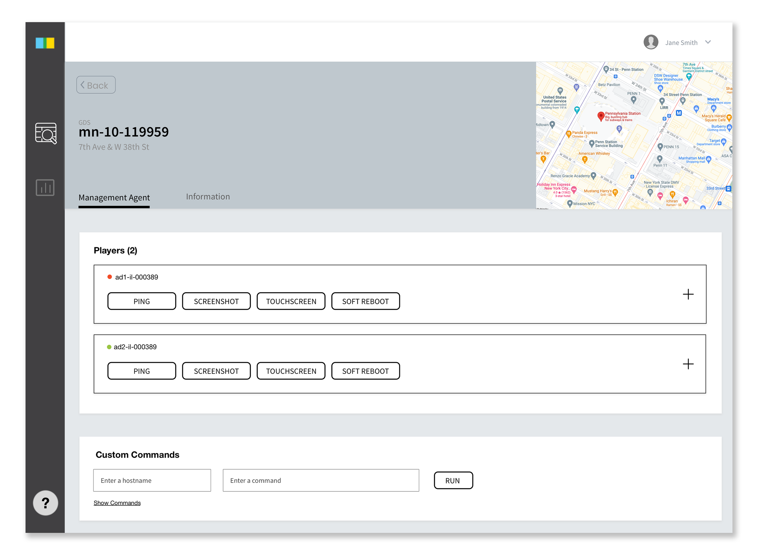
Management Agent
Once users click on the site ID, they can fully control the players on Management Agent tab. Since most of buttons and information were not being used, everything combined into two tabs.
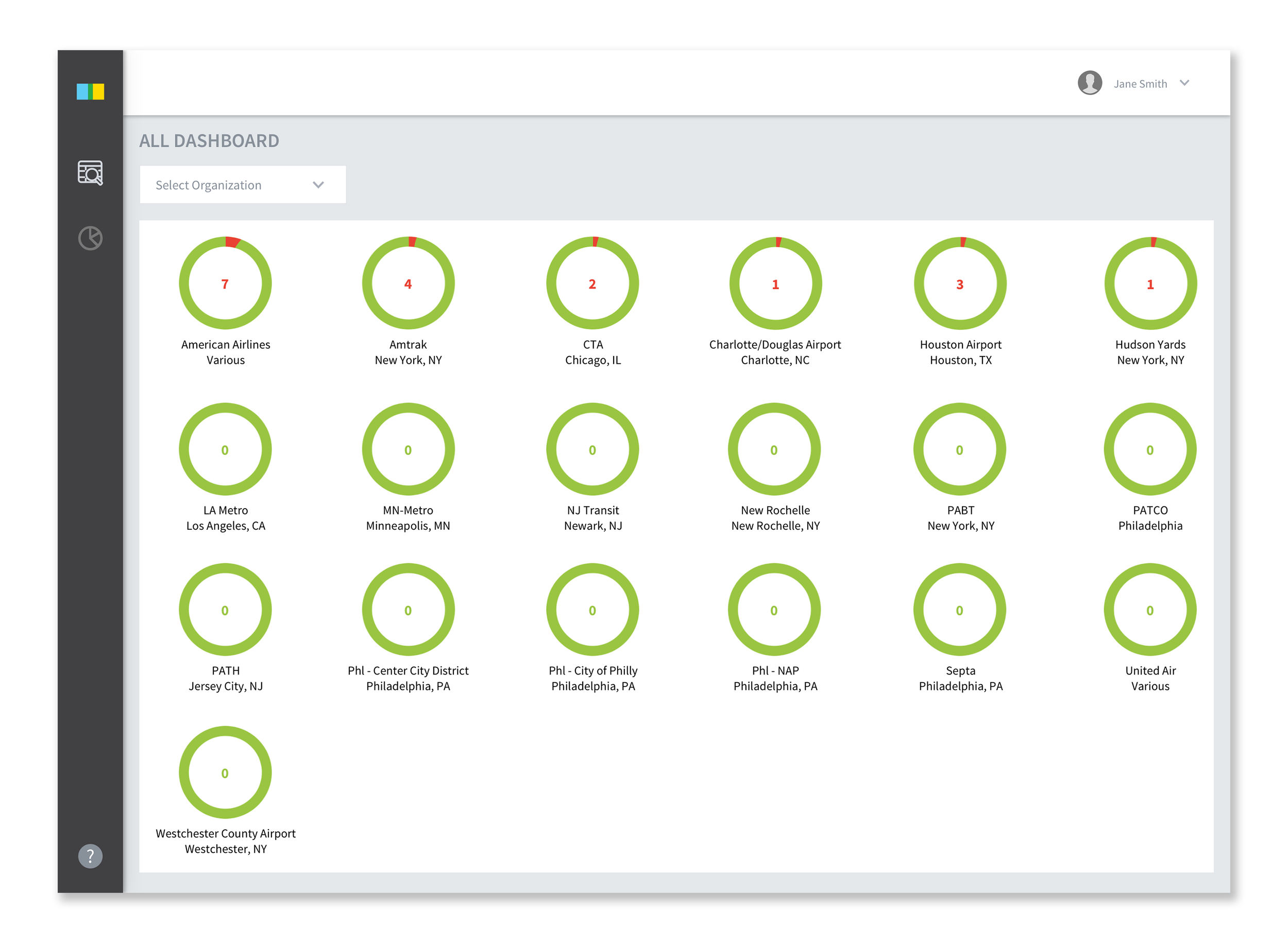
Dashboard (Work in progress)
Previous dashboard was only available after selecting an organization to view each organization dashboard. New dashboard allows users to see health status at once.
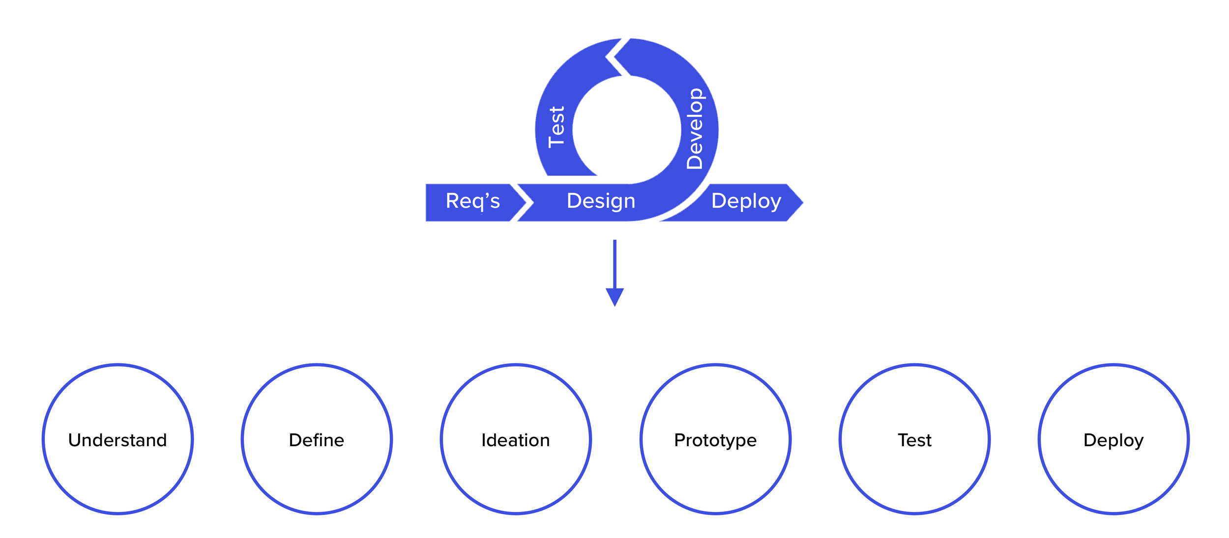
Process
Since I was very new to the company, I wanted to understand the product and users of Fleet. I designed the process as Understand, Define, Ideation, Prototype, Test, and Deploy. From user interviews, design, QA, to deploy, I led the process. For user interview, I booked a 45-minutes session with 6 users. After the user interview, I ran site audit to see what users are talking about their pain points.
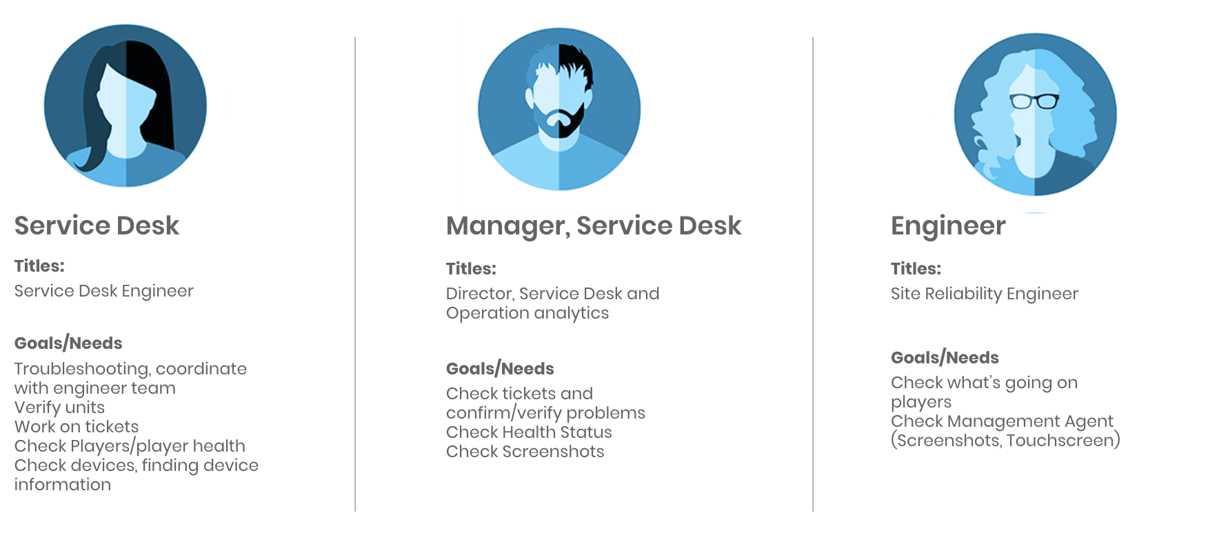
User Interview (45 minutes each)
-
Ayesha Rahim
Director, Service Desk
-
Keshia Jackman
Senior Service Desk Engineer
-
Josue Corea
Service Desk Engineer
-
Christopher Neidig
Director, Product Manager
-
John Pierce
Director, Site Reliability Engineer
-
Frank Manna
Senior Site Reliability Engineer
Major Takeaway from User Interview
-
Fleet is not reactive
Whenever users try to troubleshoot or reboot, Fleet does not tell whether it’s rebooted or not, or it’s receiving data from Service Desk.
-
Some functions are not being used
There are some functions both Service Desk engineers and SRE don’t use.
-
Search function is not intuitive
Users have to type exact number and be on the same location channel all the time to search.
-
No onboarding
Without onboarding from the same team engineer, there’s no way to learn about the platform. The whole website is too internal language based.
-
No communication about new features
Site reliability engineers make features to use by themselves and service desk engineers are not aware of those new features.
-
Only few working well
Users have to make their own experience to understand the platform. There are only few features that users feel intuitive.

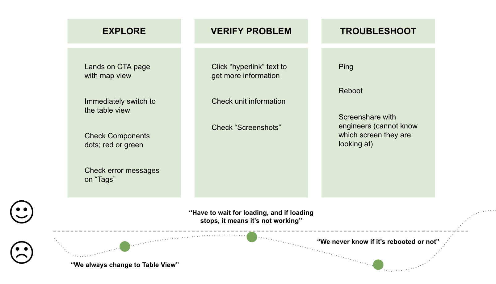
Service Desk User Journey
Wireframe
Since the project is internal platform project, there’s engineering effort constraint. I came up with 2 options for the landing page and 2 options for the management agent. After initial wireframe, I tested with users again to check if these match their needs.
Wireframe feedback on landing page
Users prefer to see empty state landing page instead of organization list page because it’s faster to select organization and check for devices.
Wireframe feedback on selected org state
Users felt dashboard being on the top of the page is taking too much space. I re-organized the columns based on the users’ work flow. Organizing by an arrow feature is visible now since users didn’t know it exists.
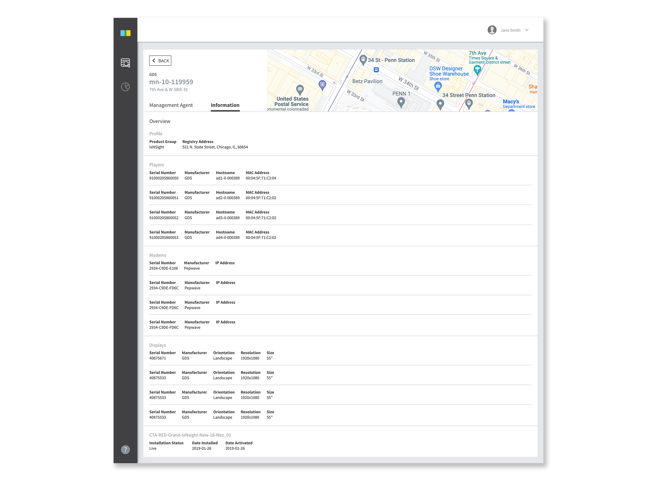
Wireframe feedback on management agent
Users still prefer to see Management Agent as control place and Information tab as informative place. However, they like the idea of accordion expanding to show primary buttons and secondary buttons.
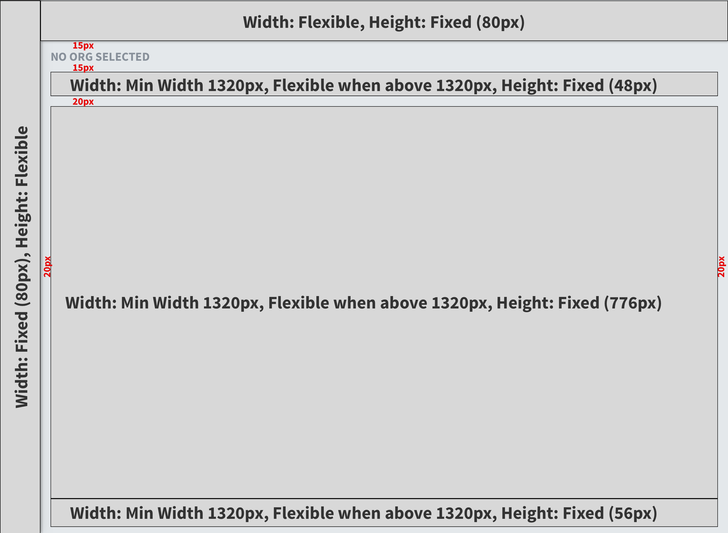
Final Design
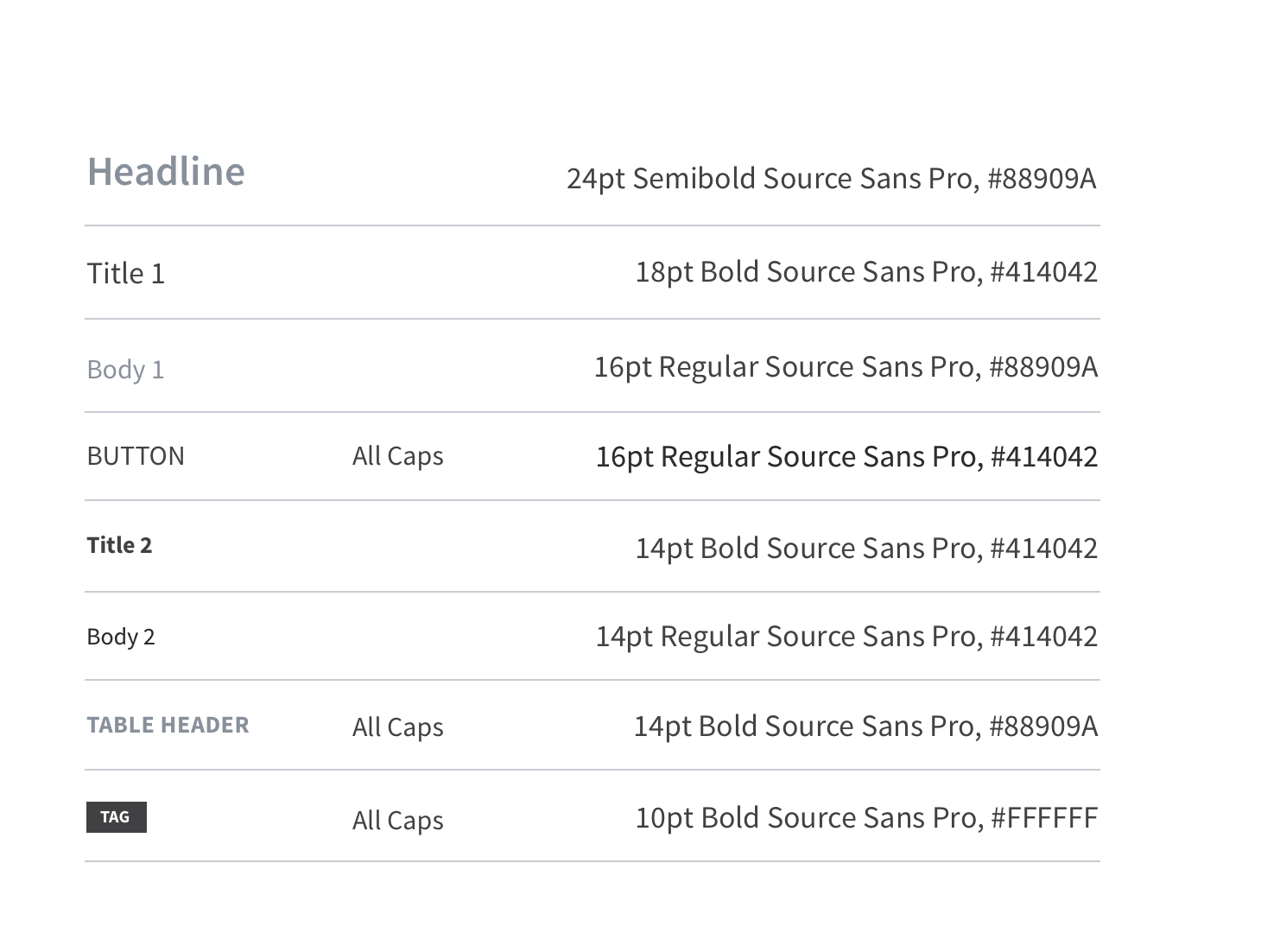
The team has only back-end engineer to work on the platform, so I built screen structure to go over which area should be flexible. Although users only use desktop to use Fleet, I had to consider table responsiveness to decide how users view. I also designed type family to be used across the platform so that it can be used on another Fleet platform that we have called IxNConnect.